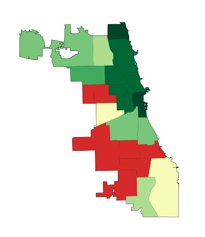
Here are two maps:
HOMICIDE RATE BY POLICE DISTRICT
1990-1993 2008-2011


Like the captions say, the one on the left shows homicide rates by police district in the early 90s, when crime was at its peak in Chicago, and the one on the right shows the same thing, but about two decades later.* The areas in dark green are the safest; the ones in dark pink are the most dangerous. The colors are calibrated so that green areas are safer than average for the early 90s, and pink ones are more dangerous than average for the early 90s. The 2008-2011 map keeps the same calibration: green is safe compared to the early 90s, so that you can see change in the levels of violence over time.
And, indeed, the first thing that jumps out from these maps is that there’s way more green nowadays, and it tends to be darker. The city is way safer! Some areas we might consider a bit dicey today – like, say, the Lawndale/Little Village area – actually register as light green, meaning that by early 90s standards, they would be considered relatively safe.
[For those of you craving numbers, the murder rate averaged 30 per 100k during the first period, and 17 per 100k during the second, a decline of nearly 50%.]
Of course, the other thing we notice is that there are some very distinct patterns to safety. These maps are breaking exactly no news by indicating that the more dangerous parts of the city are on the West and South Sides, but it is striking, I think, to see that nowadays, basically the entire North Side is the darkest green, which translates to a homicide rate of less than 6 per 100k. In fact, the dark-green part of the city has a murder rate of 3.3 per 100k.
Three point three. In New York City, which is constantly (and mostly correctly) being held up as proof that urban safety miracles can happen in America, it’s 6.3. Toronto, which as far as North American big cities go occupies a fairy tale land where no one hurts anybody, had a homicide rate of 3.3 per 100k as recently as 2007. The North Side is unbelievably safe, at least as far as murder goes.
But there are none of the darkest green on the West or South Sides. There’s actually a fair amount of pink, meaning places that are relatively dangerous even by the terrifying standards of the early 90s.
This raises a question: Has the great Crime Decline benefited the whole city equally? Are the South and West Sides still relatively dangerous because they started from such a bad place, or because they haven’t seen nearly as much of a decline as the North Side has?
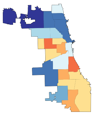
Here is the answer in another map:
CHANGE IN HOMICIDE RATE, EARLY 90s – LATE 2000s

The areas in darkest green saw the greatest decline; red means the murder rate actually increased.
So: Yes, the great Crime Decline is a fickle thing. The North Side saw huge decreases (in Rogers Park, it was over 80%) pretty much everywhere; the few areas that are lighter green were the safest in the city to begin with. The parts of the South and West Sides closest to downtown – Bronzeville, the West Loop, Pilsen, etc. – got a lot safer. But most of the rest actually got worse, including some neighborhoods that were already among the most dangerous in the city, like Englewood and Garfield Park.
This is a complicated state of affairs, and probably goes at least part of the way to explaining why, in the face of a 50% decrease in homicides citywide over the last two decades, many people persist in believing that the opposite is true: because in their neighborhoods, it is. It’s a dynamic that defies an easy narrative, and makes me slightly less angry (though only slightly) at all those journalists who have written in the last year or two about murder in Chicago without mentioning that the city is, in fact, safer on the whole than it has been in fifty years.
Here is one final pair of maps:
RATIO OF POLICE DISTRICT HOMICIDE RATE TO CITY AVERAGE
1990-1993 2008-2011
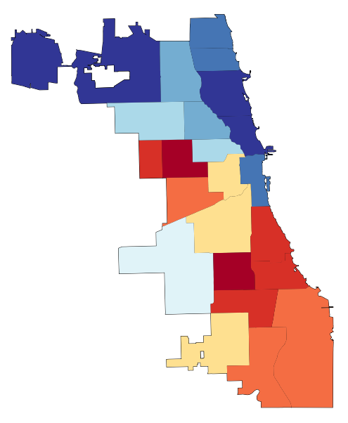

This is slightly less intuitive. These maps show the how the homicide rate in any given police district compares to the citywide average, using ratios; for example, if the homicide rate in West Town is 10 per 100k, and citywide it’s 5 per 100k, West Town’s ratio is 2 to 1. If West Town were 2.5 per 100k, its ratio would be 0.5 to 1. (Obviously the numbers in these examples are made up.) Blue areas have ratios below 1, and so are relatively safe; red ones above 1, and are relatively dangerous.
With the help of these maps, I’m going to ignore what I said about all this defying an easy narrative, and try to supply one: Over the last twenty years, at the same time as overall crime has declined, the inequality of violence in Chicago has skyrocketed. The pattern of what’s blue and what’s red in each map is mostly the same; I count only three out of twenty-five districts that switched from one color to another. But the colors are much darker in the 2000s than they were in the 1990s. There have always been safer and more dangerous areas here, as there are everywhere; but the gap between them is way, way bigger now than it used to be.
Numbers will help this case. Imagine that for each of these two time periods, we cut the city into equal thirds: one contains the most dangerous neighborhoods; another, the safest; and the last, everything else. In the early 90s, the most dangerous third of the city had about six times as many murders as the safest third. By the late 2000s, the most dangerous part of the city had nearly fifteen times more homicides than the safest third.
In addition, here are two charts:


The divergence is self-evident. The early 90s look very roughly like a normal curve: most neighborhoods are in the middle, and there’s a clear, if slightly bumpy, slope down towards the extremes.
Today, any semblance of a normal curve has been annihilated. Or, actually, that’s not quite right. Now it looks like there might be two completely separate normal curves, one with a peak at 0.2-0.4, and the other peaking at 3.1-4. Plus a few guys who got lost in the middle.
I suppose there are many, many things that one might say about what this means, but here’s the bottom line: The disadvantages and tragedies that people in “dangerous” neighborhoods experience are both absolute and relative. The death of an innocent person** is an indescribable loss no matter what. And, on that count, things are somewhat better for Chicago’s most violent areas: the homicide rate for the most dangerous third of the city declined from 51 to 39 per 100k in the time period we’ve looked at here. That is a real accomplishment, and hundreds, if not thousands, of people are still with their families and friends because of it.
But in other ways, it does matter if other parts of the city are getting safer much, much faster. When people weigh safety in their decisions about where to live, they do so by comparing: How much safety am I gaining by living in one neighborhood versus another? The same is true of entrepreneurs considering where to open their next business. The same is true of tourists looking to explore the city. The same is true of locals looking to travel to another neighborhood to eat out or go shopping.
On every one of those counts, the disadvantages that are accruing to already-disadvantaged neighborhoods in terms of lost population, investment, and connections to the rest of the city are now much more severe. The hurdles are that much higher.
That’s bad for those physical neighborhoods. It’s also terrible for the people who have good reasons to live there, like social networks, nearby family, or the affordability of real estate.
Because I don’t have the data in front of me, but who would doubt that over these same twenty years, there has also been a growing gap between how much it costs to live on the safe North Side compared to the more dangerous parts of the South and West Sides? Who would doubt that, as the North Side reaches Toronto-level peacefulness, the cost of rent has greatly diminished the number of apartments there affordable to the poor and working class?
In other words, just as the stakes have been tripled as to whether you live in Relatively Safe Chicago or Relatively Dangerous Chicago, it has become much, much harder to establish yourself on the winning side.
So: Next time you hear someone talking about “record violence” in the city, tell them that actually, murders are down almost 50% from twenty years ago. And then tell them that what’s really alarming is murder inequality.
* Why does this data end in 2011? Because I made these maps using data from the Chicago Police Department annual reports, which are available online, and which only broke down crimes by police district in the 1990s. In 2012, the police district boundaries changed, making it not quite an apples-to-apples comparison to prior years. Maybe somewhere data exists by Community Area for the early 90s, and then I could redo all of this.
** And I think reporting like that done by This American Life at Harper High in Englewood ought to challenge conventional middle-class ideas about “innocence” in the ghetto. It is very easy for those who don’t live in the neighborhood to talk about “thugs” and “gangsters” getting what they deserve. It is also very cruel, and very naive about what exactly “gangs” are, and what kind of people join one, and how, and why.
