Readers deserve a bigger picture on “super-vouchers”

I co-wrote this post with Amanda Kass, a PhD candidate at the University of Illinois at Chicago’s urban planning school, and Research Director at the Center for Tax and Budget Accountability.


Housing Choice Vouchers, also known as Section 8 vouchers, were intentionally designed as a segregation-fighting tool. Theoretically, their recipients can use them to rent anywhere, breaking with public housing’s sad history of concentrating low-income people—and, in Chicago, usually black people—in neighborhoods that are systematically deprived of investments.

But a new article from the Better Government Association and the Sun-Times—the first in a series on the state of the Chicago Housing Authority—has produced the following map of where vouchers actually get used:

Screen Shot 2016-03-15 at 10.33.28 AM
Credit: Sun-Times

Anyone with a basic familiarity with Chicago’s geography can see that, far from breaking with historic patterns of segregation, the vast majority of housing vouchers are used in segregated black neighborhoods on the South and West Sides—many of which are in exactly the same places where a racist mid-20th century City Council decided to concentrate the original public housing projects to begin with.

But the BGA and Sun-Times spent more time scrutinizing the small handful of voucher recipients in high-income neighborhoods than the broader failure of the program to challenge existing patterns of segregation. Nor, in a long feature, did they investigate how the CHA made its policy decisions, or in whose financial interest those decisions might be; or why moving to “opportunity areas” might be an important goal for the program to begin with.

That’s a shame, because the BGA and the Sun-Times reporters they collaborated with have a long history of producing excellent work that shines a light on true injustice and mismanagement. But this particular effort falls far short of that standard.

The March 11th piece is couched in the language of “inequities.” Not inequity between the rich and poor, but between different low-income households receiving vouchers. “The CHA pays for some to live in high-rent, luxury properties…in upscale neighborhoods that are predominantly white,” they explain. “On the other hand, thousands…remain clustered in poor, black neighborhoods on the South Side and West Side.”

Large sections of the article amount to listing particular arrangements in which voucher recipients get “rich deals” to live in “extravagant” homes, letting the reader know how the low-income person pays “little or nothing,” and how much the “taxpayers cover.” The article highlights two men in Uptown who “pay more than some voucher-holders do for high-priced condos downtown,” without connecting that to the fact that what voucher holders pay is based on their income, not their place of residence—which makes sense for a program designed to allow low-income people to move to more opportunity-rich neighborhoods and reverse decades of discriminatory policies. The cumulative effect (including how it has been promoted on social media) comes dangerously close to stoking resentment of the low-income people who happen to be using housing vouchers for the program’s intended purpose of moving from areas that have been systematically disinvested to higher-opportunity neighborhoods.


This is unfortunate for a number of reasons. First, the article spends an inordinate amount of time on recipients of “super-vouchers” who, by the BGA/Sun-Times’ own numbers, make up a tiny fraction of the overall voucher program. Just 298 households—out of 45,000 total families receiving voucher assistance—live in apartments that cost $2,000 or more a month, and over 97 percent of recipients live in places where the rent is under $1,500. Yet roughly half the article is devoted to detailing the supposed scourge of low-income people who are receiving too much help.

Second, the reason why the Chicago Housing Authority is even allowed to issue “super-vouchers” is never mentioned. The Chicago Housing Authority is one of a handful of housing authorities in the United States that is in a federal demonstration called Moving to Work. As a participant of that demonstration the CHA is allowed to experiment with different rent structures. In 2010, the U.S. Department of Housing and Urban Development granted it permission to implement its exception rent policy, and the stated purpose of that policy was to expand housing choice for low-income households.  

Third, it’s not clear what is gained by accusing an anti-poverty program of profligacy by listing, over and over again, rental subsidy figures without much context about how they came to be. For example, voucher holders with physical disabilities often have trouble finding accessible housing—and frequently their best option is a relatively new, “luxury” building. It would be helpful to know what portion of households living in very-high-rent apartments are there for accessibility reasons. (On Twitter, one of the authors indicated that roughly a tenth of “super-voucher” holders are disabled.) It would also be good to know how and why voucher holders chose the locations they did—for example, proximity to good schools or jobs. Given the documented discrimination against voucher holders, how many landlords in opportunity areas are actually willing to rent to them? Are the rents the CHA is paying for the “super-vouchers” in line with market prices for those areas? Did the CHA steer households to units in opportunity areas owned by politically connected developers?

Finally, the repeated insinuation that the handful of households receiving very large vouchers are responsible for the problems of recipients who still live in segregated neighborhoods, or who don’t receive any assistance at all, is just incorrect. “The CHA spends….$7.5 million a year on…spacious homes [and] condos in skyscrapers,” the authors say—without noting that that’s less than two percent of the CHA’s $470 million voucher budget—before pivoting to tell us that the voucher waiting list is 50,000 names long.

A casual reader would be forgiven for concluding that perhaps the list is so long because the CHA is spending all its money on these supposed high rollers. But in fact, the CHA’s voucher waiting list is so long because a) federal voucher funding covers less than a quarter of qualifying households nationwide, and b) the CHA has simply declined to use a substantial portion of the federal money it does receive for vouchers. An investigation by the Center for Tax and Budget Accountability found that the CHA diverted voucher funding to build up a reserve in excess of $400 million—money that could have paid for as many as 13,534 additional vouchers. But that fact never appears in the BGA/Sun-Times story. Nor does reporting by WBEZ and the Chicago Tribune about rampant discrimination against voucher holders, which might go some way to explaining persistent patterns of segregation.

What makes this even more frustrating is that there are serious policy issues to be debated. The tradeoffs between prioritizing higher-cost “opportunity areas,” versus maximizing the number of vouchers but sending more of them to low-income neighborhoods, as well as the systematic disinvestment in low-income neighborhoods that fuels the necessity to move to an “opportunity area,”  are thorny and worth exploring. So are questions about why and how the CHA chooses the priorities it does. In fact, there is evidence that keeping a long voucher waitlist might actually be in the agency’s financial interest. In 2013, Standard & Poor’s gave the CHA the highest credit rating among all public housing authorities, in part because of the “very strong essentiality for CHA housing as demonstrated by a waiting list that exceeds” the actual number of households receiving assistance. In other words, the CHA was rewarded with a high-profile stamp of approval, and easier, cheaper access to credit markets, because it failed to help a large proportion of the people who needed it. That fact might have helped readers understand how structural issues affect the CHA’s behavior, and Chicagoans’ lives.

But perhaps what really galls is just the spectacle of “watchdog journalism” turning its ire on the supposedly undeserving poor at a time when the wealthy are living more luxuriously than ever, and the governments that are meant to guarantee a basic standard of living for everyone else are abdicating that responsibility in astonishing ways. It is hard, in reading about a low-income, probably black family whose voucher allows them to live in a highrise with “sweeping views of Lake Michigan,” not to think of Reagan-era rhetoric about “welfare queens,” who drove in Cadillacs bought with taxpayer money. Those stories were mostly fiction, of course, but served a real role in undermining public trust in safety net programs that ultimately make all of us, as a society, stronger. This report, sadly, appears to do the same.

The March 11th article is the first of several features that the BGA and Sun-Times are collaborating on, examining the state of the Chicago Housing Authority. We’ve corresponded with some of the authors, who have been open to discussing the criticism and committed to covering this issue in a fair and contextual way. While we are disappointed by the tone and focus of the first article we are hopeful that future reports will shine a light on how important policy decisions are being made in Chicago.

What I learned playing SimCity

Like most city lovers of a certain age, I spent many hours as a kid playing SimCity. For readers who are tragically uninitiated, SimCity is one of the iconic computer games of the 1990s, though new versions have been released as recently as 2013. Playing as mayor (or, really, dictator, but more on that later), you shepherded the growth of a city from its very first streets to towering skyscrapers—assuming you weren’t wiped out by tornados, fires, or aliens. By making thousands and thousands of people plan commercial, industrial, and residential districts for their virtual towns, the creators of SimCity have probably done more than anyone in the history of the world to introduce basic principles of zoning to the public.

SimCity 2000. Credit: 01229, Flickr

Recently, I started playing a successor to SimCity, Cities: Skylines (or CS, as I’ll call it). CS is very much like SimCity, with some added details (at least compared to the last version I played) and much better graphics. But unlike when I was ten, I can also appreciate that CS, like SimCity, has a whole host of assumptions about how cities work, and how urban governance works, built into the gameplay—assumptions that are both frustrating as a player and fascinating as someone who spends a lot of time thinking about real urban planning and governance. While all games that simulate real life are of course drastically simplified, the way that they’re simplified often speaks to the actual worldview of the people who design and play them. With that in mind, here are some notes on what a video game can teach us about the biases and blind spots of real-life urban planning in the US:

Read the rest at City Observatory.

The O’Hare express train: An unreasonably terrible idea

At Chicago Magazine:

A week ago the Tribune reported that the Emanuel administration is taking preliminary steps toward building an express train to O’Hare Airport, an idea first floated by then-Mayor Richard M. Daley more than 20 years ago. In theory such a train would speed travel time to downtown in exchange for premium prices—probably $30 to $35 per ride, according to the Tribune.

The city is hiring an engineering firm to spend nearly a year studying the project, but in the spirit of civic generosity, I am sharing my findings right now for free: this is a terrible idea.

Here are four reasons.

Screen Shot 2016-02-23 at 12.19.03 AM

The mythical American heartland; or, What is the Midwest?

When I moved back to Chicago in late 2011, one of my goals was to get published in the Reader within six months. Six months and five years later, I did it! Here’s an excerpt:

Fortunately, Vox is here to explain: “The midwest is . . . the states where agriculture was, historically, the major industry. . . . They’re states where the dominant religion is some branch of Protestant—often Lutheran or Methodist. And they’re states where Scandinavians and other northern Europeans settled in droves.”

Unless you’ve never left Andersonville, this is an odd description to try to apply to Chicago, which VanDerWerff acknowledges as the midwest’s capital. Agriculture is historically important here—in the form of industrial meatpacking and LaSalle Street futures trading—but so are steel, railroads, and corporate headquarters. Only about one in ten people in the Chicago metro area identify as some kind of mainline Protestant, according to the Pew Research Center; about a third are Catholic, and another third belong to evangelical Christian denominations, black Christian denominations, or non-Christian religions. And for the last hundred years at least, the cultural fabric of most of the city has been dominated by people of eastern European descent, African-Americans from the south, and, over the last few generations in particular, Latin American immigrants and their children and grandchildren.

Screen Shot 2016-02-15 at 5.39.56 PM

Make housing vouchers an entitlement

At City Observatory:

We could extend housing vouchers to every very-low-income household—and expand housing support to the middle class, too—if we were willing to take away just one of the big housing subsidies to people making over $100,000 a year.

But let’s back up.

Previously, we’ve made the case that the SNAP program, or food stamps, is a pretty good template for thinking about how to reform the way we do housing assistance. SNAP is available to everyone below a certain income threshold; if you apply and you qualify, you get money to buy food.

Housing is very different. There are a million different housing assistance programs, but all of them are quite limited in scope: if you apply and you qualify, you are simply one of many such people fighting over a much smaller number of vouchers or set-aside affordable units. In some cases, this makes housing assistance more like a lottery game than a social service, as when nearly 2,600 people applied for just 18 homes in San Francisco, 58,000 people applied for 105 homes in New York, or nearly 300,000 people were placed on the waitlist for a Chicago Housing Authority unit. Nationwide, about 20 million people qualify for housing assistance but don’t receive it.

You'll be waiting a long time for a public housing unit at this mixed-income development in Chicago. Credit: Google Maps
You’ll be waiting a long time for a public housing unit at this mixed-income development in Chicago. Credit: Google Maps

But how much would food-stampifying housing policy cost? Surely an unreasonable, pie-in-the-sky amount, right?

Well, fortunately for us, the Congressional Budget Office has already done the legwork to figure it out. In a study published in September, the CBO gamed out a large number of possible directions to take housing policy: bigger, smaller, budget-neutral tweaks, transfers from one program to another, and so on.

One of the options it analyzed was expanding the Housing Choice Voucher (also known as Section 8) program to everyone who qualifies—which, at the moment, is anyone whose income is below 50 percent of “AMI,” or the median income in their area. (In most metro areas, that puts the upper limit for a family of four at between $25,000 and $35,000). The CBO estimated such a policy would cost about $41 billion a year over the next ten years. A more modest approach, targeted to only the extremely low-income—those making less than 30 percent of their area’s median income—would cost about $29 billion a year.


But despite these shortcomings, it’s hard to overstate just what a revolution in housing policy entitlement vouchers would be. Affordable housing is a national challenge, but in recent years, it has largely been up to local governments to tinker around the edges of overwhelming need—and even the most ambitious local governments simply don’t have the resources to do much more than tinker around the edges. San Francisco’s massive Proposition A, which voters approved in November, will bond $310 million for affordable housing—its own proponents decided their initial goal, $500 million, would strain the ability of the city to service the debt—which will likely result in less than a thousand net new units of affordable housing. In Chicago, the signature affordable housing policy of the last few years is supposed to create just 1,000 units of affordable housing, even as 300,000 people are on the waitlist for a public unit. In Austin, a community land trust was able to make national news while creating three affordable homes, with 25 more in the pipeline.

Local efforts to to provide housing relief to those who need it are necessary and important. But only the federal government has the resources to address the full scale of the issue. In fact, there is already at least one federal housing program that could be scaled up to take a massive bite out of the housing problem, relieving one of the most terrifying and dangerous consequences of poverty. We could pay for it simply by deciding that households that make more than $100,000, people whose income is above 80 percent of the country’s, don’t need housing subsidies. What kind of government turns down that deal?

Read it all.

Homevoters v. the growth machine

At City Observatory:

There are two big theories about who controls the pace of development in American cities and suburbs.

One is the “growth machine.” In this telling, developed by academics like Harvey Molotch in the 1970s, urban elected officials and zoning boards are highly influenced by coalitions of business and civic leaders interested mainly in economic growth and maximizing the price of the land they own.

The growth machine view. Credit: Matthew Rutledge, Flickr


The other, developed later by the economist William Fischel, is the “homevoter hypothesis.” Fischel argues that real power—at least in the small to moderately-sized municipalities in which the majority of Americans live—is held by homeowners, who are also interested primarily in maximizing the value of their property: their homes.

The homevoter view. Credit: Richard Masoner, Flickr


These two theories closely track two of the major camps in the debate about what’s wrong with American housing policy. If you believe in the growth machine, either because you’re a reader of Molotch or it just happens to coincide with your general worldview, you’ll probably believe that US cities suffer from too much development, pushed on an unwilling populace by a profit-driven elite for whom zoning and planning is an inconvenience at most.

If you’re in the homevoter camp, conversely, you’re likely to think that the problem is too little development, as NIMBY homeowners scare local elected officials into blocking any housing development that might compromise their property values—either simply by increasing the housing stock, and thus the number of “competing” sellers, or by introducing “undesirable” kinds of people or buildings.

snip

  • Interestingly, proximity to high-quality infrastructure and services made land more likely to be changed in both directions—that is, land far from high-quality infrastructure and services was more likely to remain in its original zoning category. But in almost every case, proximity was especially likely to lead tomore downzones. For example, parcels in high-performing school districts were 43 percent more likely than the typical parcel to be upzoned—but 392 percent more likely to be downzoned.
  • Correlations with market growth were weaker—but they suggested that growing markets were associated with downzoning. Parcels in neighborhoods seeing rapid population growth were 41 percent more likely to be downzoned, for example. Parcels in neighborhoods seeing rapid home value increases were about 20 percent less likely to be upzoned, although they were also 27 percent less likely to be downzoned.
  • Downzoning was very strongly correlated with whiter neighborhoods: parcels in Census tracts that were over 80 percent white were more than seven times more likely to be downzoned than parcels in tracts that were less than 20 percent white.
  • Parcels in tracts with high homeownership rates were 43 percent more likely to be downzoned, and 25 percent less likely to be upzoned. Parcels in districts with high voter turnout were 230 percent more likely to be downzoned, and 53 percent less likely to be upzoned.

A $1.6 billion proposal

At City Observatory:

Second, this case highlights the fact that rising home prices create massive capital gains—not just for landlords and developers, but regular homeowners as well. In some cases, this is a actually a big win for equity, particularly when property values increase rapidly in neighborhoods where homeowners are predominantly lower income or people of color. That might represent a small blow against the racial wealth gap. (Although it is likely to be quite a small blow indeed, given research showing that black first-time homeowners actually lost wealth on net in housing over the course of the entire decade of the 2000s. Neighborhoods that see large increases in property wealth are actually disproportionately likely to be white.)

But from a policy perspective, these capital gains represent a huge opportunity. In this particular case, the homeowner was able to earn a nearly 700 percent return on her investment and still leverage half a million dollars to determine the occupancy of her home after she left. But even if we could count on other private residents to use that power as “ethical landlords,” it would leave the housing market open to private discrimination, as we already argued. Moreover, as Kriston Capps pointed out, there’s no guarantee of long-term, let alone permanent, affordability: the next owner is under no obligation to be similarly “ethical.” And finally, very few landlords, no matter how “ethical,” are likely to give up enough profit to provide deep subsidies: even in this case, the film teacher ended up selling for $650,000, which stretches the definition of “affordable” even in San Francisco.

What if, instead, we could harness a small percentage of these private capital gains for publicly-funded, truly affordable housing? After all, we already leverage the profits of developers for affordable housing in the form of inclusionary zoning requirements. But those programs almost never create very many affordable units, simply because preserving five, ten, or even 20 percent of newly constructed units for low-income people doesn’t add up to much when all newly built homes make up a tiny proportion of the community as a whole. In the five years from 2010 to 2014, San Francisco’s inclusionary zoning program produced, on average, 140 units of affordable housing a year—not nothing, but also hardly enough to make a real dent in the issue.

But a small tax on the capital gains of homeowners whose property values grew the most could produce funds to build or preserve a meaningful number of affordable units. To be more progressive and protect wealth for working- and middle-class homeowners, the tax could be structured so that it only fell on those who earned significantly more than “normal” returns, or whose homes were extremely valuable to begin with. It could also be collected only when a home is sold, to avoid adding to the burden of people with valuable homes but only moderate incomes. (As an added benefit, such a tax could have the effect of deterring other exclusionary behavior by homeowners, if William Fischel’s ideas are correct.)

The money collected could be used, not to sell a $650,000 home to whoever had the best organic produce, but to create permanent (or at least long-term) affordable housing to whoever needed it at prices actually targeted to the low income. How much money are we talking? Well, in 2013, the total value of homes in the San Francisco metropolitan area grew by $159 billion. A regional tax that captured just one percent of that value would generate nearly $1.6 billion a year. San Francisco’s Proposition A, by contrast, passed this November, creates a one-time bond issue of $310 million; and the in-lieu fees raised by SF’s Inclusionary Housing ordinance in 2014 were $30 million. Of course, it’s not quite fair to contrast a regional measure with a municipal one—but the point is that $1.6 billion a year is a lot of money, equivalent to thousands of new affordable units a year. And it’s money that Bay Area governments are currently leaving on the table.

Harnessing these capital gains in places where real estate values are rapidly appreciating to create a stream of truly affordable housing funds is an ethical housing policy. Asking current homeowners and landlords to discriminate based on their own private biases is not.

What I’ve been up to

Although the vast majority of my writing energy goes into City Observatory now, I’m going to make an effort to update this space with the work I publish over there, since almost all of it continues themes that I had been covering at this blog. (There will also periodically be new just-for-City-Notes content, as with the post on the CTA’s bus improvements this week.)

Anyway, in a one-time effort to catch up, here’s some of what you’ve missed if you haven’t been reading C.O.:

1. The origins of the urban housing crisis. A three-part series on a chapter of William Fischel’s Zoning Rules!, which tries to explain how a revolution in land use law in the 1970s led us to the current regime of zoning laws and sky-high prices. I begin with a parable (because everyone learns better with parables), and then a more direct look at Fischel’s ideas about the 1970s, and finally a more critical examination of what he proposes to do about it.

Excerpt:

…perhaps one of the most interesting and important arguments in the book is that our current crisis of high housing prices has its roots in the land use revolution of the 1970s.

Prior to that decade, Fischel writes, zoning had certainly been effective in creating exclusionary communities—since the 1920s, many critics (and some proponents) had argued that that was the whole point. It did so by creating legal districts where only high-cost housing could be built. But these exclusionary communities existed at the scale of the neighborhood or the suburb: other municipalities in the same metropolitan area acted as a kind of housing development safety valve, accepting higher-density development and keeping the regional housing market more or less in balance.

But in the decades after World War Two, something changed. Suburbs that had been pro-growth amended their zoning laws to shut the door on higher-density housing—and sometimes any housing at all. As a result, exclusionary zoning was transformed from something that constrained development in individual communities to something that could operate on the level of an entire metropolitan area.

The results have completely changed the economic geography of American cities. Before the zoning revolution of the 70s, the highest-cost metropolitan areas had home prices that were about twice the national average; by 2000, that gap had doubled to four times greater than the national average.

2. What filtering can and can’t do. Most housing occupied by low-income people is actually priced by the market, despite the near-universal use of the words “affordable housing” to mean homes with special low-income government subsidies. But there’s a great deal of vagueness about exactly how housing built for middle- or upper-income people becomes “naturally occurring” (a terrible yet common phrase) affordable housing. I look at a new-ish study that gives some of the best details yet on the process. Verdict: We need more (specially subsidized) affordable housing, but we also need filtering to start working again in big, expensive metro areas.

Excerpt:

But “affordable housing” also suffers from an ill-defined relationship to the market. Typically, the phrase “affordable housing” means “below market rate,” as in a home that receives some sort of subsidy, private or public, to be cheaper than what the owner could otherwise charge. (Of course, even this distinction—subsidized versus unsubsidized—is problematic, or just plain incorrect, given the massive subsidies to middle- and upper-income homeowners through mechanisms like the mortgage interest tax deduction.) But in most of the country, the vast majority of homes that are actually “affordable” to lower-income people are sold or rented at market rate. They just happen to have some characteristics—size, appearance, or location in a less-desired neighborhood—that make their market prices relatively low.

But very little private housing in the United States was originally built for low-income people. Instead, homes built for the middle or even upper classes gradually became cheaper as they aged, as people with high purchasing power moved into trendier, more modern homes in “better” neighborhoods. As higher income households move on, the now somewhat older homes or apartments they formerly occupied are sold or rented to people with more modest incomes.

This process is called “filtering.” While the evidence that filtering is a real phenomenon has been around for a long time—the core of nearly every American city contains neighborhoods with once-luxurious homes now occupied by people of modest incomes—the first study to provide a rigorous measure of how it happens was published only in 2013. In it, Stuart Rosenthal of Syracuse University uses nearly 40 years of data from the American Housing Survey to figure out the average pace of filtering across the country, and what makes housing filter more quickly in some places than others.

Rosenthal uses the AHS to compare the incomes of people living in the same units of housing over time. He estimates that nationwide, housing “filters” by roughly 1.9 percent a year—meaning that a 50-year-old home is typically occupied by someone whose income is about 60 percent lower than that home’s first occupant. (All of these numbers are adjusted for inflation.) You might think of this process as something like “reverse displacement.”

Screen Shot 2015-11-21 at 12.13.36 PM

3. What’s really going on in gentrifying neighborhoods? A look at new research on how demographic change actually happens in gentrifying areas, which confirms most previous research, which says: it’s about who’s moving in, not who’s moving out. Despite some high-profile cases, it turns out that existing residents of communities where average income is rapidly increasing are not much (or, in some cases, at all) more likely to leave the neighborhood than if average income weren’t increasing. Which doesn’t mean that the end result might not still be exclusionary—it just means we ought to be directing out attention in somewhat different places.

Excerpt:

A new study from the Federal Reserve Bank of Philadelphia challenges this narrative. The authors (Lei Ding and Eileen Divringi of the Fed, and Jackelyn Hwang of Princeton, who has written other notable studies on gentrification) tracked movement in and out of urban neighborhoods in Philadelphia from 2002 to 2014, and look at the effect of rising rents and incomes on existing residents. From our perspective, there are three big takeaways.

First, demographic change in gentrifying neighborhoods doesn’t happen the way most people think it does. Ding et al find that in gentrifying neighborhoods, existing residents are just 0.4 percentage points more likely to move out in a given year than they would be in a non-gentrifying neighborhood. (As a baseline, just over 10 percent of all residents moved in a given year.) Even in those neighborhoods with the most rapid increases in rents and income, existing residents are just 3.6 percentage points more likely to move. Moreover, because the authors are interested in involuntary displacement, presumably for economic reasons, they look at whether people who leave gentrifying neighborhoods are more likely to move to poorer communities. In most cases, the answer seems to be no.

So what explains the changing income and ethnic backgrounds of residents in these communities? In short, it’s not who’s moving out; it’s who’s moving in. People who would have left anyway are replaced by a whiter, more affluent group of people; most neighborhoods have turnover rates high enough that this dynamic alone can change the makeup of a neighborhood’s residents quite quickly. To quote the study: “Overall, the results are more consistent with the notion that changes in the characteristics of inmovers are a more important force in determining the demographic changes in gentrifying neighborhoods.”

Exciting changes to Ashland, Western buses—but also some questions

So Dorval Carter, who took over as CTA President this summer from Forrest Claypool, and who told the Tribune‘s Jon Hilkevitch in an early interview that one of his priorities would be improving the bus network, is now taking some notable steps in that direction. In the CTA’s board meeting today, he announced the reintroduction of the #11 Lincoln bus and #31 31st St. bus, which had been the focus of a crosstown coalition of activists for some time (though only on a temporary basis, subject to ridership—the same qualification put on the ill-fated late-night Purple Line Express pilot earlier this year).

6101629355_64a0c97b39_b

He also gave more details on the reintroduction of express bus service at rush hour on the 9-Ashland and 49-Western buses. Until 2010, both had express service as part of a ten-line network of “X” routes, which overlaid express lines that stopped every half mile over the local routes, which had stops every eighth mile. In 2010, nearly all of those express routes were cut as a cost-saving measure in the aftermath of the recession.

In addition to reinstating the X9 and X49, the CTA will do something many transit advocates (including me) have been screaming and muttering under our breath about for years: consolidate stops on the local service. Instead of having stops every eighth of a mile, the all-day local services on Ashland and Western will stop roughly every quarter mile, cutting the number of stops nearly in half. While boardings are extremely concentrated at certain stops—major activity centers and transfer points, mostly—anyone who’s taken a CTA bus, particularly at rush hour, has had the experience of stopping on literally every block to let off one or two people. Only about 15% of riders will have to walk the extra block to a stop—since the vast majority of people already get on or off at one of the relatively busier stops that will be kept—but nearly everyone will save time, as the bus won’t have to pull over nearly as much.

As (potentially) great as the reinstatement of the Lincoln and 31st St. buses is, the Ashland/Western news is even more exciting.* That’s because the improvements to the 9 and 49 could theoretically be implemented on routes across the city. When they were cut, the X routes were extremely popular—the CTA itself, in its materials about the new express service, reports that 86% of riders had a positive opinion about them, and many of the X routes (including Western) had ridership at or above their local parallel as of 2010. While the fact that the X9 and X49 will be limited to rush hour is disappointing, if they regain their old popularity, it could set the stage for the reintroduction (and maybe even expansion) of the X route network.

And while there may be some funding constraint on new express routes, stop consolidation ought to be basically free, apart from studying exactly which stops ought to go. Because some number of riders will have a longer walk to get to the bus, and because time savings increase as the length of rides increase, stop consolidation should be targeted at routes where boardings are very concentrated at certain stops and most people use the route for relatively long trips—but that describes a pretty large number of routes.

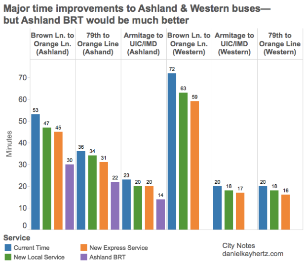
Still, these moves raise some questions. To illustrate a few of them, I made a chart (based on CTA reports) of the estimated time savings of these new services, plus the on-hold Ashland Bus Rapid Transit project.

Screen Shot 2015-11-18 at 7.02.57 PM

(Note too that in the spring of 2016, the CTA is planning on rolling out transit signal priority on both routes—meaning that buses will be able to hold lights green or make red lights turn faster to avoid idling too long at intersections. That’s estimated to save an extra 5 minutes on each route, end to end.)

So here are some thoughts:

  1. The moves announced today really do represent significant time savings. That’s most evident on longer trips, obviously: the X9 will be 8 minutes faster than the current service from the Brown Line to the Orange Line (a trip you might take if you’re going from the North Side to Midway, or from the Southwest Side to a Lincoln Square service job), and the X49 will save you 13 minutes over the same trip on Western. But 20 to 17 minutes, though it seems small, is nothing to sneeze at, especially given how low-cost these changes are. Moreover, by reducing the number of stops, buses will probably be less likely to bunch, making wait times more reliable.
  2. A huge amount of the time savings comes just from consolidating to 1/4 mile stop spacing. The difference between the new local service and the express service is small enough that it will basically always make sense just to take whatever comes first, even if it’s the local: if you wait more than a minute or two for the express, you’ve wasted more time waiting than the express would save you once you’re riding. As I understand it, the current plan is for the express to be essentially a “supplementary” service on top of the local, which will run more frequently. But if people are just getting on whatever the first bus is, then it may make more sense to make the express the basic service, and the local the supplementary.
  3. Restoring X route-type service is great, but it’s not nearly as good as true BRT. In almost every case, the difference between current travel times on the 9 and travel times on the new X9 will be smaller than the difference between the X9 and Ashland BRT. Recall that the anti-BRT activists’ counterproposal was, essentially, the 1/4 mile stop-consolidated new local service. You can see in this chart just how much less convenient that service is than BRT—on the order of 30-50% longer trip times. The news that the X9 was coming back made a lot of transit advocates despair that Ashland BRT was truly dead, and this was our consolation prize. But we should continue to push for true BRT, on this corridor and others—it’s clear that there are still huge gains to be made.

* Though the 11/31 news is exciting for the additional reason that it represents a successful multi-neighborhood organizing campaign for better bus service—a model that hopefully will be adopted by other neighborhoods, and other organizations, across the city.