1. December 2014 was the first month of year-over-year ridership growth for CTA buses since November 2012. (Zero point one percent growth, but you know, it’s the trend that counts.) January 2015 was the second. (5.6% – though from a very low baseline of Polar Vortex-ified January 2014. Still down from January 2013.) Eagerly awaiting later numbers to see if this is a turnaround that will stick.
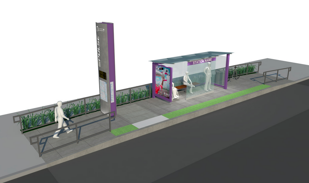
2. Pace, Chicago’s suburban bus service, has launched the website for Pulse, its rapid bus network initiative. Eventually, Pace plans 24 routes throughout the six-county area – though mostly serving suburban Cook. The first two lines to be implemented will be along Milwaukee Avenue, going northwest from the Jefferson Park Blue Line station, and Dempster Street, from Evanston to O’Hare.
The lines will have stops roughly every half mile, raised stations with real-time arrival information and heating, and limited transit-signal technology to give the buses priority through traffic lights. (Though only when it doesn’t affect car traffic, which is a pretty big “only.”)
The most important thing, though, might be the frequency, which is planned for every 10 minutes during peak periods and 15 minutes the rest of the day. Fifteen minutes is the outer edge of acceptable, but for a suburban bus network, it’s pretty exciting. Kudos to Pace.
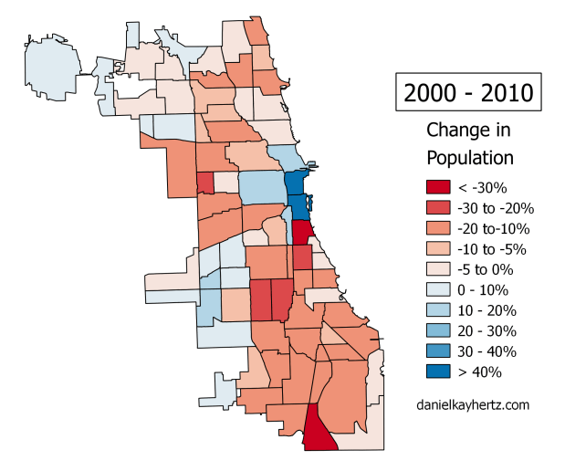
Here’s one way to put Chicago’s demographic problem: Since 1950, the city has lost more people than currently live in all of San Francisco, Boston, or D.C. After finally increasing its population in the 1990s, the 2010 Census found that Chicago – unique among the large, relatively prosperous cities we consider our peers – had declined by 7%, or around 200,000 residents.
Indeed, just a couple miles from the heart of the Loop lies a neighborhood that, despite a rich history, beautiful architecture, and quick access to the second-largest business district in America, has lost 40% of its population since the middle of the last century. An area that once held 102,000 people is now home to barely 64,000.
That area is called Lincoln Park.
For a long time, most accounts of Chicago’s lagging population have focused on parts of the South and West Sides where many residents, largely African-American, have decided to decamp for the suburbs or the South in search of better schools, less crime, and more jobs.
But the under-appreciated flip side of population loss in those parts of the city is that places that ought to be growing like gangbusters are stagnant, often sitting 25% to 50% below their peak populations. Lakeview, for example, was once home to 124,000 people; its population is now 94,000. North Center is down from nearly 49,000 to under 32,000. West Town, which includes Wicker Park and Bucktown, has fallen from 187,000 to 81,000.
Compare the maps: many of Chicago’s wealthiest neighborhoods are dramatically below their peak populations.
Even more startling, these areas aren’t necessarily gaining back those people. Lincoln Park, Lakeview, and North Center all actually lost population in the 2000s. Logan Square, whose rapid ascent as a “hot” neighborhood picked up steam during that decade, was home to 11% fewer people in 2010 compared to ten years earlier.
The problem, obviously, is not that people don’t want to live in these neighborhoods. Home prices and rents have skyrocketed over the last ten to twenty years; average incomes have climbed with them, as more and more of the well-to-do decide Chicago’s North Side is a place they’d like to call home.
So what’s going on? And why should we care?
One reason is that over the last few generations, Americans all over the country have spread out a bit: apartments that used to hold a family of five or six now contain a family of three or four – or maybe a childless couple who have turned a bedroom into an office. Or maybe just one person, living alone. This is especially true in wealthier areas, where people can afford to buy themselves more space. As a result, if a neighborhood has roughly the same number of housing units it had fifty years ago, it probably has a significantly lower population.
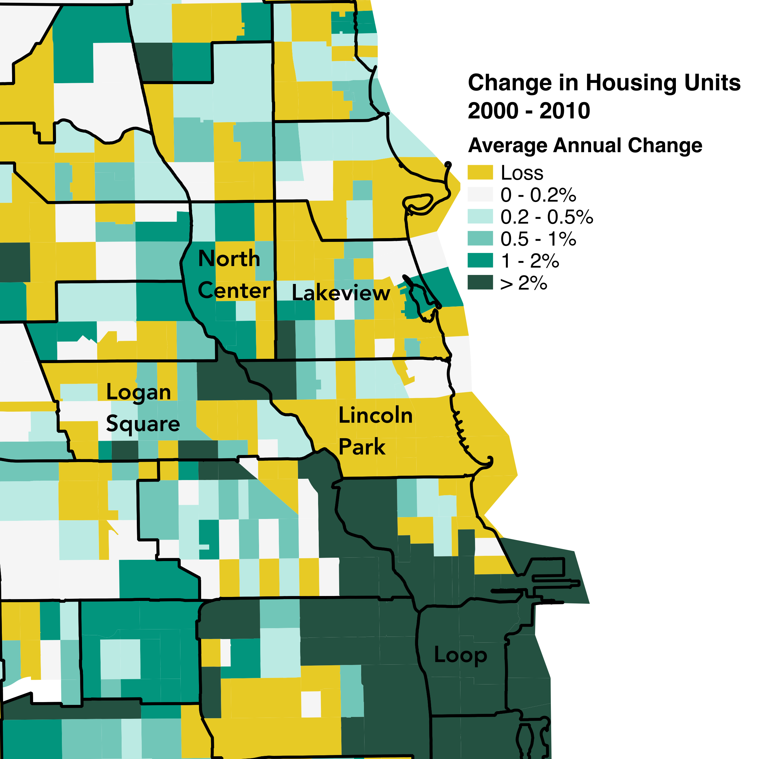
But that doesn’t explain why these neighborhoods, which have become so popular, haven’t seen the construction of more housing units. For most of Chicago’s history, when a neighborhood became more popular, builders created more housing, turning houses into three-flats, and three-flats into courtyard buildings. In a few really high-demand areas, like right along the lakefront or near downtown, they might even have built highrises.
Note that outside of the central area, high rates of housing construction exist mainly along the river – along the western border of Lincoln Park and North Center. Many of those areas were formerly non-residential. Small amounts of new construction translated to high percentage growth.
But for the last several decades, increasingly strict zoning laws have outlawed this kind of gradual build-up. Instead, Chicago’s laws allow a massive boom in parts of downtown – mostly where there weren’t enough white-collar residents to complain – while putting a tight lid on the neighborhoods.
Since replacing a couple two-flats with a courtyard building is now illegal, developers make money by tearing down an old two-flat and building a luxury two-flat in its place. Or they build a mansion, and the neighborhood actually loses a housing unit. As a result, as a neighborhood becomes more attractive, the city encourages fewer people to live there.
And that’s how we arrived at the bizarro-world reality that Lincoln Park actually lost roughly the same number of housing units as Englewood between 2000 and 2012.
You can see how dramatic the effect is by looking at population growth around the borders of downtown: where relatively loose downtown zoning holds sway, the number of residents boomed. But instead of gradually tapering off as you get further away, there are sharp drop-offs all around the central area. Often, a few blocks where the population grew by 50% or more are right next to a few blocks where population actually declined. In most cases, zoning plays a crucial role in those disparities.
But so what? Why does any of this matter?
For one, it matters because if the number of housing units in a neighborhood is capped, as that neighborhood becomes more desirable, affluent new arrivals will outbid existing residents and people of moderate income, pushing up housing prices and creating newly segregated enclaves. If we want regular people to be able to live in some of our safest, most transit-accessible neighborhoods, allowing the supply of housing to grow with demand is a crucial part of that affordability.
Second, as places like Lincoln Park become forbiddingly expensive, some people decide their next best option is, say, Wicker Park or Logan Square. When they arrive, they open coffee shops and hipster bars, attracting people with more money, who then bid up housing prices there, expanding the parts of the city where the working class simply can’t afford to live.
But most potential residents will just decide to move to the suburbs. And, once there, they won’t be supporting neighborhood businesses. They won’t be contributing to the city’s tax base. In other words, by pushing people to the suburbs, we’re giving up neighborhood jobs and money the city desperately needs to provide services in every neighborhood in the city, including – especially – the ones that are actually struggling, far from Lincoln Park.
The fact that Chicago’s affluent North Side communities have lost so many people, and aren’t gaining them back, is a huge problem for many local businesses, current residents of moderate means, and anyone who would like to move there but can’t afford to.
But even if none of that describes you, it’s also a problem for those of us who’d like to see City Hall have more resources to invest in other parts of the city, from policing, to schools, to transit, to road repair. It’s a problem for those of us who’d like to see more jobs created within commuting distance of Chicago communities where unemployment is endemic. It’s a problem, in other words, for all of us.
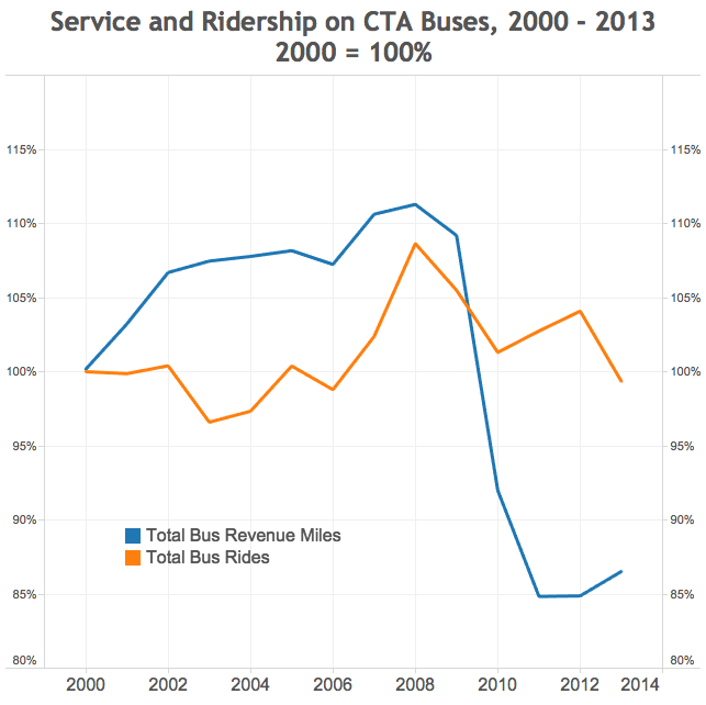
It’s hard to overstate how big a transformation of Chicago’s transportation landscape this is. As recently as the 1990s, there were well over two bus riders for every rail rider; the city’s transit was as much about a crosstown streetcar-era bus grid as it was about a downtown-focused heavy rail network.
But rail ridership has nearly doubled in the last 20 years, and bus ridership – which stabilized in the early 1990s after a long period of precipitous decline – has begun to fall again in the last few years.
The reasons for that aren’t entirely clear. Ridership began a notable dip right after the 2008 economic crash, which makes sense – fewer employed people means fewer commutes. But the more recent decline, which seems to have started in 2012, is harder to explain. Precisely because it’s hard to explain, I suspect, many of the theories offered are quite vague: many of them are of the “people just don’t like buses” variety.
“Revenue miles” is just a measure of service. If there’s one bus route that’s 10 miles long, and it’s served by one bus that travels from the beginning to the end and then back again, that’s 20 revenue miles. Source: National Transit Database
But I think any discussion of bus ridership in Chicago needs to include this chart, and take two things away from it.
1. First of all, declining bus ridership is not actually a “long-term” trend, though it’s often framed that way. (Or, to be more specific: decline is typical of the last 50 years, but not the last 10 or 20.) In fact, as recently as the mid-2000s, ridership was growing. And other than the deep recession years of 2009-2010, 2013-2014 represents the first multiyear ridership decline since the mid-1990s. This isn’t meant to wave the problem away: it actually makes it worse, since it suggests that far from experiencing a long, slow decline driven by structural factors, something specific has changed recently that’s made buses less attractive.
2. Secondly, service matters. I think it is probably not a coincidence that ridership growth in the 2000s came at a time when the CTA was adding service: reducing wait times between buses, expanding their hours, and introducing express routes. (Between 2002 and 2006, the CTA created ten “X” routes, which mostly followed existing bus lines, but stopped every half mile instead of every eighth. Almost all of them were discontinued in 2010 because of a budget shortfall.)
I think it is also probably not a coincidence that the CTA has had a difficult time recouping its bus ridership losses from the recession, given that its dramatic recession-era service cuts have mostly remained in place.
To be clear, this isn’t at all a slam on the CTA, which can’t raise significant revenue without raising fares. Moreover, it has launched some bus service improvements in the last few years – the Jeffery Jump, the “Loop Link” busway, and the proposed Ashland BRT – that make a good template for expansions into the rest of the system.
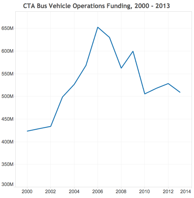
In constant 2013 dollars. Source: National Transit Database
But the money for more broad-based, bread-and-butter improvements to service just hasn’t been there. And unlike rail customers – who are generally downtown commuters, and have to think about paying downtown parking rates if they want to ditch public transit – bus riders who already have a car face no such massive disincentive to using it. To be competitive, buses need to run frequently and reliably, and make decent time along their routes. They are absolutely capable of doing that, given relatively modest investments in operations funds, technology, and space. But we’re not making nearly enough of those investments.
(I’d also point out that the headline, as ever, is slightly unfair to the actual argument, which acknowledges that in some places, gentrification and displacement are actually problems.)
The maps themselves are simplified, grayscale versions of these. But since the Sun-Times didn’t include them in the online version of the article, I thought I’d post them here, in case anyone was curious.