The immaculate conception theory of your neighborhood’s origins

Screen Shot 2015-09-24 at 10.47.44 AM

Is a myth that’s worth dispelling. At City Observatory, here’s the conclusion:

But there are important lessons to be learned by looking at what the bungalow era actually looked like, rather than our romantic imagination of it.

One is that everything old was once new, and new things often provoke a backlash. We ought to be humble in believing that our opinions represent some timeless, objective truth, looking backwards or forwards. The same bungalows that seem to us quaint and charming were tacky and soulless to many of the people watching them be built; it seems more than possible that the new apartment buildings we vilify today will be thought of sentimentally by future generations who know them only as an important part of their city since they were born.

A second lesson is that American cities have an impressive history of growing to accommodate new arrivals. Berger leaves out of his column, as is frequently left out in “immaculate conception” stories, that the bungalow era was also the fastest period of urbanization in American history: Between 1900 and 1930, Seattle’s population grew more than fourfold, from 80,000 to over 360,000—a rate of growth approached or exceeded by many other American cities at the time. In the process, millions of rural Americans and immigrants were given the opportunity to live in newly industrializing cities where wages and quality of life were dramatically higher. Today, most of our cities have shut the door on that kind of growth. (Seattle’s growth rate today, while much higher than many other central cities, pales in comparison to the bungalow era Berger wishes we would return to.) As a result, our doors are no longer open to as many people, from this country and others, who would like to make better lives by moving to places where job openings and quality of life are high.

Finally, the bungalow era suggests that building new market-rate housing that’s affordable to working-class and low-income people in urban areas is hard, especially if that housing takes the form of single-family homes. And it’s worse today: while the bungalow builders had the advantage of lots of open land relatively close to center cities, today, that “frontier” has closed. And we’re well aware of the costs—environmental, social, and financial—of continuing to push all of our growth out further and further onto the fringe.

Rather, the deeply affordable and decent homes of the bungalow era were largely in multifamily buildings. It’s curious that, though more than four in ten of the homes built in the 1920s were in apartment buildings, that kind of construction—and those kinds of people—are entirely absent from Berger’s romantic musings about the time. But they were a crucial source of urban accommodations for people of modest incomes. As the Sightline Institute has pointed out, rooming houses and other small, multifamily homes made up a huge proportion of the affordable housing stock in cities around the country in the early 20th century. Unfortunately, a combination of regulations and market conditions has virtually eliminated that stock in most places. If we want to go return to something the 1910s and 20s got right, bringing back modestly-sized homes in multifamily buildings is a good place to start.

Read the whole thing!

How American zoning differs from other countries’ land use law

I have a piece over at City Observatory that I think is kind of cool. (Also, if you read this blog, you should really just read Zoned in the USA by Sonia Hirt.) An excerpt of the City Observatory essay:

Hirt’s major claim is that what really sets American zoning apart is its orientation, explicit or implicit, to putting the single-family residential zone at the top of the hierarchy of urban land uses. Not only are single-family zones listed first in many zoning codes, but they make up significant pluralities, or even majorities, of total land area in most American cities. Interestingly, Hirt points out that this wasn’t necessarily true when zoning was first introduced: New York’s famous first zoning law didn’t even have a single-family zone at all.

A zoning map of Marietta, GA. Yellow areas are zoned for single-family homes only; brown areas are set aside for apartments. The large brown area in the southeast corner contains apartments to be razed. Pink is commercial. Source: Marietta, GA website

Cities in other countries remain closer to our origins, then. In Great Britain, for example, local development plans generally set limits on residential density by the number of housing units per given land area, rather than dictate the form that those housing units must take. In the Paris area, too, land use intensity is determined by something like FAR, or the ratio of total floor area to lot area, rather than prescribing apartments or detached homes. The German zoning system, which in some ways appears very similar to ours, does not even have a single-family category.

As Hirt points out, Americans appear to be unique in believing that there is something so special about single-family homes that they must be protected from all other kinds of buildings and uses—even other homes, if those homes happen to share a wall. The recent revolt in Seattle over a proposal to soften that city’s single-family districts, in other words, would not be possible anywhere else in the world, not least because very few people live in single-family districts to begin with.

Go read it!

Brazil is a state of mind

But also, you know, a country. I don’t think I’ve ever done a photo post before, so please tolerate this one.

An art school in Rio de Janeiro.
Texture
Texture.
Different building, same texture
Different building, similar texture.
Trains, Rio
Trains, Rio.
Metropolitan Cathedral, outside
Metropolitan Cathedral, outside.
Metropolitan Cathedral, inside
Metropolitan Cathedral, inside.
Museum of Contemporary Art, Rio
Museum of Modern Art, Rio.
Train tracker, Rio
Train tracker, Rio.
Trains, São Paulo
Trains, São Paulo.
The taste of America
The taste of America.

Chiraq and stigma

This is a piece I’ve been wanting to write for a while. I’ve expressed discomfort with “Chiraq,” and the other stigmatizing ways we talk about places and people on the South and West Sides before—but I haven’t really put together a coherent argument explicitly citing the research that informs my feelings about the issue.

My hometown, Chicago, is having a fight over words: in particular, “Chiraq.” That’s a portmanteau of “Chicago” and “Iraq,” which is meant to analogize the city not to that country’s rich cultural heritage, or extreme weather, but to its war. The name seems to have come from a South Side rapper, but has since been popularized by headlines in decidedly non-South Side outlets, at least three different VICE mini-documentaries, and most recently an in-the-works Spike Lee movie.

Most cities might not have a nickname with such staying power, but they’re familiar with the concept. “Killadelphia”; “Murder Worth”; “Bullet Town”; even“Murder Kroger.” Last year, a website called “Judgmental Maps” made a name for itself by posting annotated maps of American cities; some of the entries for Atlanta, to take a city at random, included “Little Crackistan,” “Dangerous Mexicans,” and “Avoid.” The map for Washington, DC, labeled all of the Anacostia area simply “GUNS & AIDS.” Around the same time, an app called SketchFactorannounced that it could help you get where you were going while avoiding “sketchy” neighborhoods.

Judging by the debate in Chicago, many people don’t see a problem with these expressions of local reputation. In a widely-shared essay, one prominent writer declared that “Chiraq” was indicative of real problems, from violent crime to concentrated poverty, and “arguing over what to call” that “shameful reality” was simply a tool of distraction—putting up a Potemkin facade to avoid dealing with the real issues.

It’s certainly true that the problems “Chiraq”—and, for that matter, “Killadelphia” or “Bullet Town”—was meant to encapsulate are real. (Even the “Murder Kroger” really did witness a murder.) But the second part of the argument—that the name itself is harmless—is simply not true.

Over the last few years, issues of racial and economic segregation have seen a new burst of attention, covering historic issues like redlining and cutting-edge research on the effect of concentrated poverty on economic mobility. But one of the squishier sides of segregation has received much less coverage: stigma.

Stigma creates the very problems it supposedly reflects

In part, that’s understandable: it’s much harder to measure stigma than it is to measure segregation—or even, as it turns out, to measure intergenerational economic opportunity. But that doesn’t mean it’s not a real, and powerful, force. In fact, strong evidence suggests that stigma can help create the very disadvantages it supposedly reflects.

Read the rest of it here.

The weird economic geography of transit use in Chicagoland

Stereotypically, American transit users are low-income. In some places, like Chicago, transit is good enough, at least in some places, for middle-class and even upper-middle-class people to use it. But even here, surely more money makes you more likely to drive?

But not quite. In the Chicago metropolitan area – meaning these numbers include the suburbs, not just the city – the median income for a person who drives to work alone is $39,957. The median income for someone who takes transit to work is $40,314.

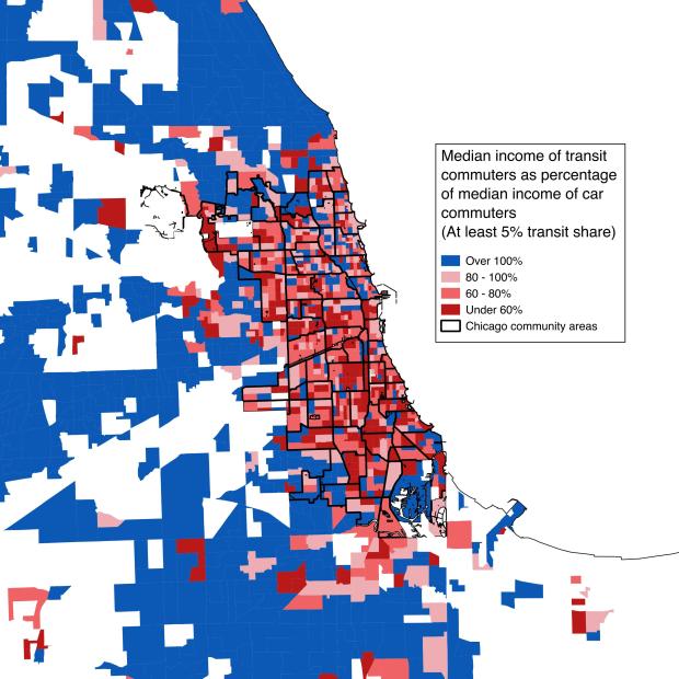
It gets even weirder if you make a map:

IncbyMode

In short, blue areas are places where the median transit-rider’s income is higher than the median car-driver’s income. As the colors get deeper red, transit-riders’ incomes are falling relative to drivers’.

The results are pretty much the opposite of what you would expect: the suburbs are almost entirely blue, meaning that an average transit-rider from, say, Naperville, is actually richer than an average driver. In the city, that’s reversed: drivers tend to be wealthier than transit-takers. (If you only look at the city, things look a little more explicable: transit-riders’ relative income is highest in gentrified North Side neighborhoods with good transit access, especially along the Blue, Brown, and Red Lines.)

What’s going on? I can’t prove it yet, but I strongly suspect that it has to do with where different kinds of jobs are.

Our normal paradigm of how someone chooses to use transit has to do with income: we assume that in any given situation, transit is probably some amount less convenient but also some amount less expensive than driving, and so people who are more price-conscious – that is, lower-income people – will be more likely to sacrifice convenience for the sake of saving money. Under that model, rich people should be more likely to drive pretty much everywhere, but as the convenience of transit improves – that is, in dense cities – the gap should narrow.

But what this suggests, I think, is that income is playing a smaller role than job location. If you live in the suburbs and work in the suburbs, transit is almost certainly a terrible option for you. Metra runs infrequently and there are few jobs to walk to from Metra stations; Pace also has long gaps between buses on many routes, and is too slow to make efficient trips across the vast distances beyond the Chicago city limits. That means that you’ll have a very strong incentive to drive, even if you’re low-income. (And recall that in places where transit is very, very bad, even most low-income people will find a way to get access to a car so they can participate in society.)

If you work in the city, though – in particular if you work downtown – transit might be a great option. Metra will drop you off within walking distance of your job, doesn’t require paying for downtown parking, and may very well be faster than taking highways into the Loop at rush hour.

That means that suburban residents who work downtown are much, much more likely to take transit than people who work in another suburb. Which wouldn’t mean anything by itself – except that the types of jobs that locate downtown don’t look like the types of jobs that locate in the suburbs. Although downtown Chicago has plenty of service sector jobs – the people who work in restaurants, supermarkets, and clothing stores – it also has a massive concentration of high-paying white collar positions. That means people who work downtown are disproportionately likely to have upper-middle-class or upper-class white-collar incomes. Which means, in turn, that transit riders in the suburbs are more likely to have those incomes as well.

Suburban jobs, in contrast, are a wider mix of service sector, blue collar, and higher-paying office jobs. That means that drivers – who will disproportionately be people who work in the suburbs – will, on average, have more average-looking incomes.

I would take two big things away from this. The first is that improving transit, which is frequently cast as a social justice issue (including by me), does not automatically benefit lower-income people more than higher-income people. (Which doesn’t mean that it isn’t worthwhile – there are other reasons to support transit.) In terms of who benefits, there’s a big difference between, say, adding a rush hour express train from Naperville to the Loop and upgrading suburb-to-suburb Pace buses – or, for that matter, buses in the city.

But the second is that you can create major transit benefits without actually doing anything at all to transit service. These maps show that wealthier people are taking better advantage of transit infrastructure in the suburbs – not because they have better access, but because of where their destinations are. That means that bringing a wider range of jobs to transit-accessible locations – in downtown Chicago, but also other Metra stops, or places where Pace buses converge, or other easily-accessible places in the city – may matter as much or more than building new lines or services. And recalling that most trips aren’t actually commutes, this applies to other kinds of destinations as well: grocery stores, other kinds of shopping, and even homes.

Which means that if you care about people being able to save money by taking transit – or the mobility of people who can’t drive, including the disabled, the young, and many of the elderly – a major part of our program needs to be about focusing new construction near transit. That doesn’t require any big multi-year studies or multi-billion-dollar federal grants: it just requires some zoning changes. Let’s get on that.


As an addendum: of course, in many places, even if transit-takers are wealthier, there are very few of them. If you remove all the places where fewer than 5% of residents take transit to work, you see that much of the Chicago suburbs is very car-dependent – but the overall pattern remains the same.

IncbyMode2

Sexy affordable housing methodology clickbait

Screen Shot 2015-07-21 at 10.19.33 PM

So I wrote a three-part series on what “affordable housing” means at City Observatory. The first two are up today; the third will be up tomorrow.

Usually, I feel like I’m pretty decent at understanding what sounds interesting to normal people, as opposed to someone who reads suburban zoning codes for fun. (Whether I act on that understanding is a separate question.) But I am shocked – shocked – that there hasn’t been a groundswell of people clamoring to discuss this series on Twitter and at my local corner store.

Because this is gripping! Consider:

1. Everyone – and I mean everyone, from HUD to any affordable housing group you can think of – uses the same 30% ratio of housing costs to income to determine what “affordable” means.

2. That ratio is kind of bogus!

3. Because everyone uses this bogus ratio:

a. Reports about, say, “how much you have to earn to afford a two-bedroom in City X” are often pretty misleading.

b. “Affordable” rents set by inclusionary zoning ordinances or other subsidies for people at a given income may not actually be affordable for people at that income.

c. We may be encouraging people to live in places and pay quantities of money that don’t make sense for their budgets.

4. Some smart guy has already come up with an alternative, which we should probably go ahead and use.

Go tell your friends!

Please, please, stop using rent numbers from Zumper

There is an apartment search site called “Zumper.” Zumper has come up with a very smart marketing ploy, which is something they call a “National Rent Report.” The “National Rent Report” reports on how much rent is, nationally, in a bunch of different cities and neighborhoods.

People like to know how much other people are paying for things, compared to how much they are paying, and they like to get updates about the course of neighborhood change, and that sort of thing, so the “National Rent Report” gets picked up by media outlets all over the place.

Most recently, I saw it on Curbed, which reported that, according to the “National Rent Report,” the median one-bedroom apartment in Chicago goes for $1,780. (I don’t mean to pick on Curbed, which I read constantly, is generally excellent, and far from the only outlet to pick up the “National Rent Report.”)

The median one-bedroom apartment in Chicago does not go for $1,780.

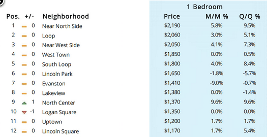
I could go into any number of reasons how I know that’s true. But the simplest is to look at Zumper’s own numbers for Chicago:

Screen Shot 2015-06-01 at 5.57.25 PM

Recall that the definition of “median” is “the point at which there are an equal number of items above and below.” Now look at this list. According to Zumper itself, there are only five neighborhoods in the entire city of Chicago where the median rent is above $1,780. If the city’s median rent as a whole is $1,780, then one of these things must be true:

1. There must only be ten neighborhoods in all of Chicago of roughly equal size, or

2. There can be more than ten neighborhoods, but half of all the one-bedroom apartments in the city must be located in just five neighborhoods.

Neither one of these things is true. Rather, the issue is almost certainly that half of Zumper’s listings are in one of those five neighborhoods, because their listings are very, very concentrated in high-end apartments.

But that makes their listings completely worthless for determining the actual median rent for the rest of us, who live in a world that is not bounded by Zumper’s database.

Which makes the “National Rent Report” completely worthless.

Let’s all stop writing about it.

Riders aren’t abandoning buses; buses are abandoning their riders

At City Observatory:

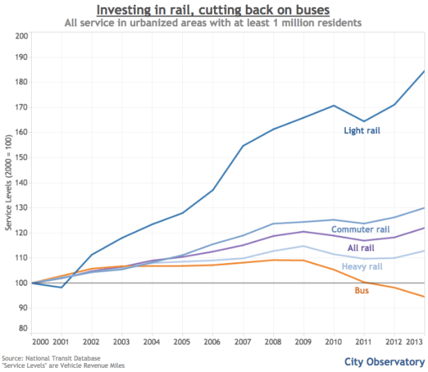
And it turns out that when you disaggregate the national data by urban area, there’s a very tight relationship between places that cut bus service between 2000 and 2013 and those that saw the largest drops in ridership. If you live in a city where bus service has been increased, it’s likely that your city has actually grown its bus ridership, despite the national trends. In other words, the problem doesn’t seem to be that bus riders are deciding they’d rather just walk, bike, or take their city’s new light rail line. It’s that too many cities are cutting bus service to the point that people are giving up on it.

Screen Shot 2015-06-01 at 12.24.36 PM

Screen Shot 2015-06-01 at 12.24.52 PM

City Observatory

Screen Shot 2015-04-13 at 10.04.55 AM

As of last week, I’ve joined City Observatory as a Senior Fellow. For those of you who don’t know it, City Observatory is a new Knight Foundation-funded urban policy think tank run by Joe Cortright. It’s been around for less than a year, but in that time it’s garnered national media coverage with three major reports and regular contributions to the online conversation about cities and opportunity. They’ve already made a name for themselves as an important and smart part of the urban policy world, and I’m really excited to join as CO grows.

I’ve written a sort of introductory post at City Observatory; if you’re a regular reader here, I don’t think there will be anything surprising in it, but it lays out, from something close to first principles, why I care about all this stuff.

Also: I will still be writing here, but probably somewhat less, and probably (even) more Chicago-centric things, since my stuff at CO will mostly be national in scope. I hope you’ll follow me over to City Observatory not only to read my stuff, but also that of my new colleagues.

And finally: Thanks to everyone who’s been reading me here. Like many of the coolest things I’ve gotten to do over the last year or so, I got my position at City Observatory largely because of this blog, and that’s pretty awesome. Looking forward to more.

Edit: Some people have asked for the RSS feed for City Observatory’s blog, which is here: http://cityobservatory.org/feed/

In the Sun-Times

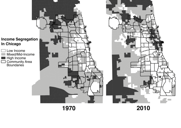
Some maps of mine are in the print edition of the Sun-Times, accompanying an op-ed by the Metropolitan Planning Council‘s Marisa Novara. The piece is called “Poverty, not gentrification, is Chicago neighborhood scourge,” and it argues…well, you know. But it’s worth reading the whole thing!

(I’d also point out that the headline, as ever, is slightly unfair to the actual argument, which acknowledges that in some places, gentrification and displacement are actually problems.)

Screen Shot 2015-03-01 at 5.18.08 PM

The maps themselves are simplified, grayscale versions of these. But since the Sun-Times didn’t include them in the online version of the article, I thought I’d post them here, in case anyone was curious.

STOped