Where does Chicago’s black middle class live?

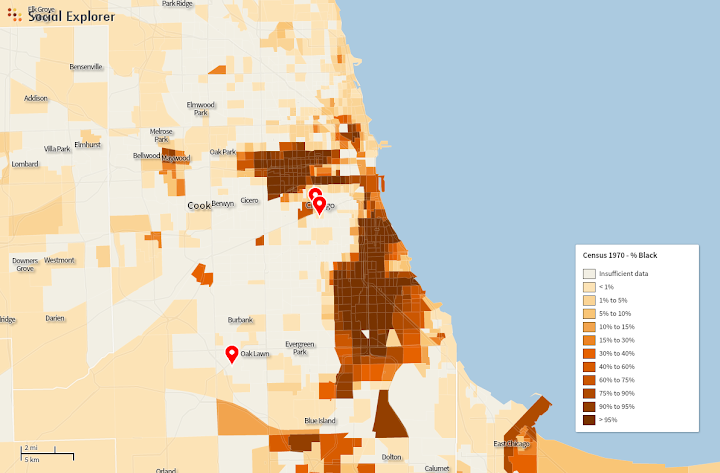
(As a foreword: I’m very conscious, as I write this, that I’m explaining something a large number of readers already know; I want to acknowledge that what I’m doing is not unearthing some previously-undiscovered secret, but trying to demonstrate a few of the basic facts of the city’s social geography that really, truly are mysteries to a huge number of people, both in Chicago and in the rest of the country. It would be nice if we lived in a world in which the black middle class were not an exotic demographic to most non-black Chicagoans, let alone the dominant view from outside the city: but we don’t, so here we are.)

There are at least three ways one might go about answering that question.

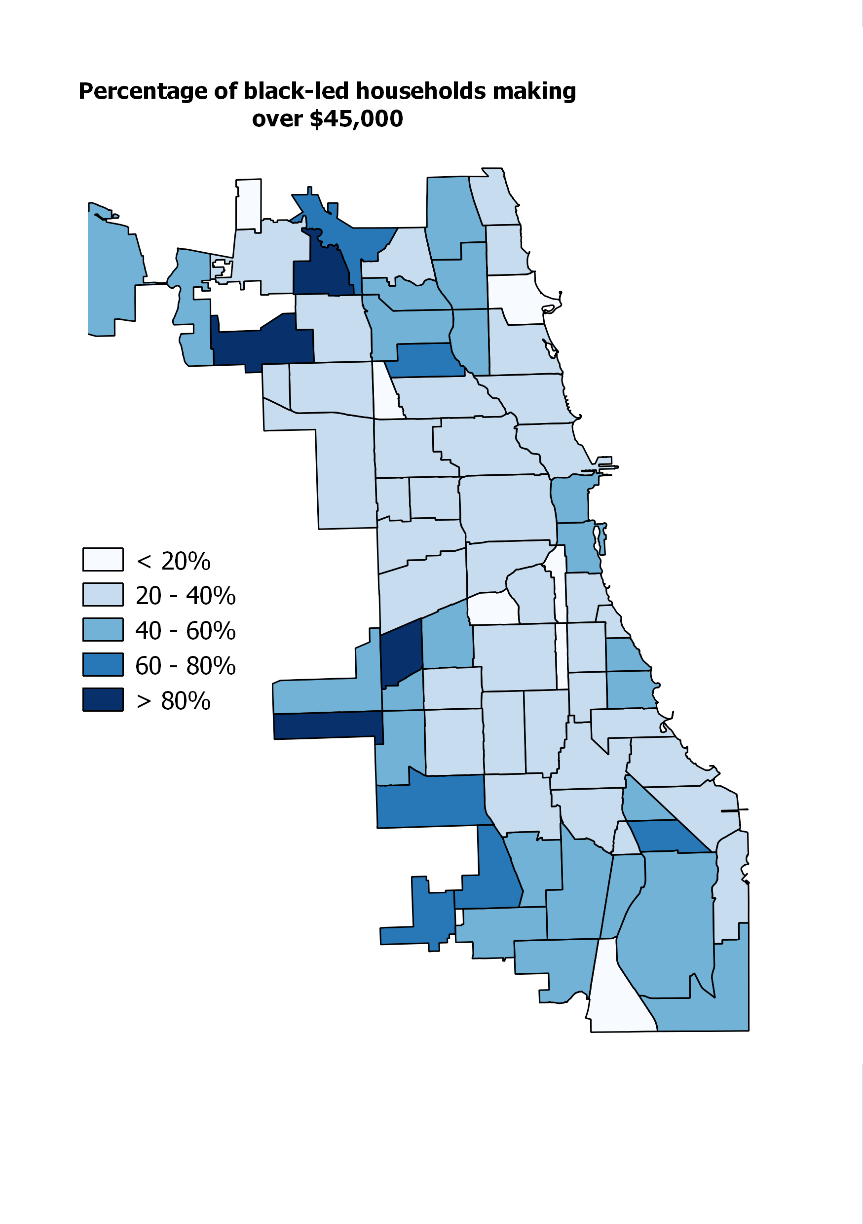
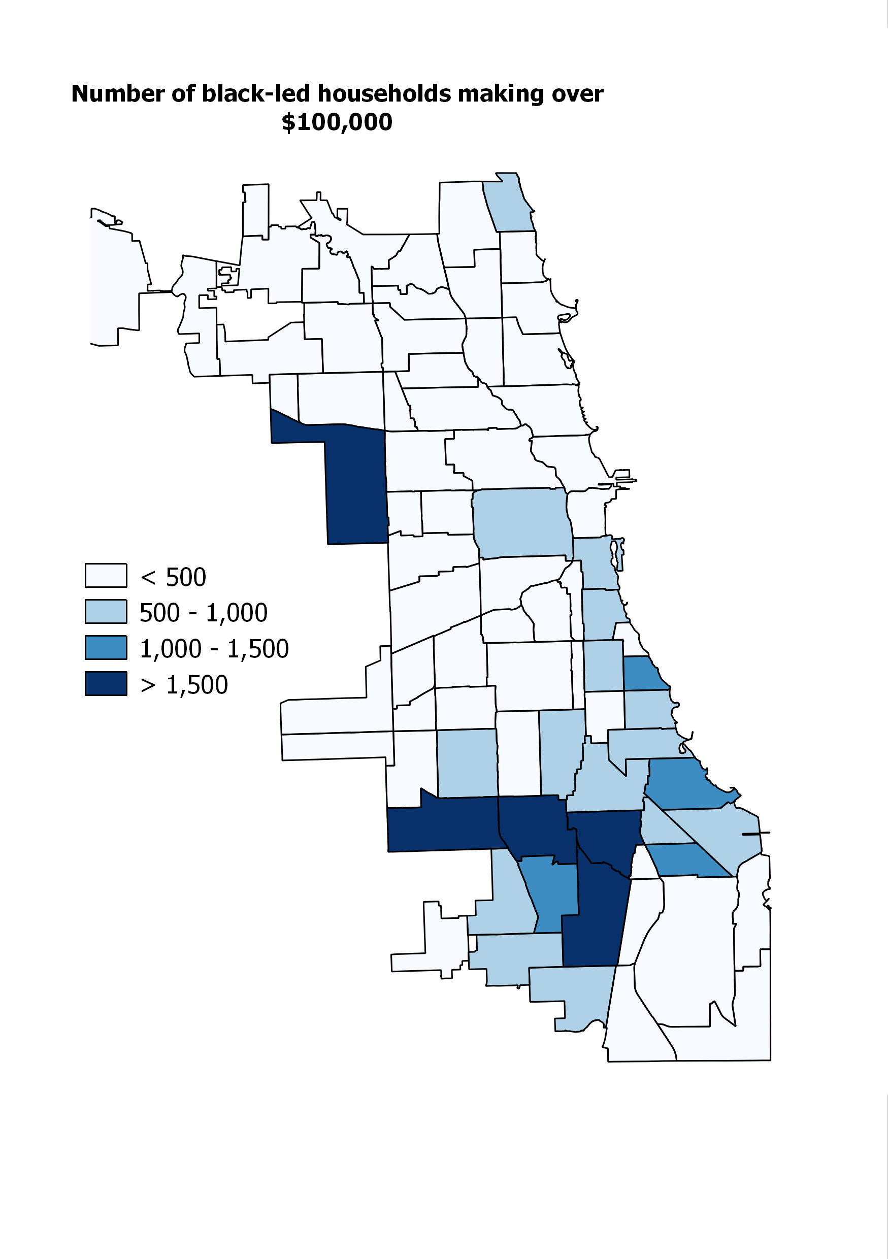
1. If you picked a random middle-class black person, where are they most likely to live?

To answer this question, you probably just want to count up all the middle class black households and tally them by neighborhood. So that’s what I did. The tricky part, obviously, is defining “middle class.” In the end, I went with something like what I did with my Chicago income segregation maps: households making at least 75% of the metropolitan average income, which works out to about $45,000 a year. There are a million problems with this: it doesn’t account for household size, or life station (a 26-year-old with a bachelor’s making $40,000 doesn’t count, even though nearly anyone who met them would consider them middle class, while a single parent with four children making $45,000, whose economic and social position is likely much, much more precarious, does), or any number of other things. I considered using education, but in a city like Chicago – and this is especially true among African Americans, I think – a huge number of people with middle-class lives have union jobs that don’t require a college education.

Anyway, with all those caveats, here’s the map:

B45totSo the answer is mostly on the South and West Sides: that’s Austin there on the far West Side, with the largest number; Roseland, Auburn Gresham, and South Shore are the leaders on the South Side.

There are things to say about this, but I’m going to go through the next two maps before I say them.

2. If you picked a random person in a given neighborhood, what’s the likelihood that person would be black and middle-class?

B45per

In effect, what this does is control for the number of people in each community area. Austin, for example, which looked super impressive in the first map, now looks less impressive; it turns out that it has a lot of middle-class black people mostly because it has a lot of people, period.

Anyway, the standouts now are Calumet Heights, the darkest-blue trapezoidal shape on the far Southeast Side; Avalon Park just to the north; and Roseland, Washington Heights, and West Pullman on the far, far South Side.

3. Finally, if you picked a random black householder in a given neighborhood, what is the likelihood that person would be middle-class?

B45perofB

This is a considerably weirder, and in some ways more misleading, map. There are now standouts on the Northwest and Southwest sides, in addition to the far South Side; but, if we refer back to the first map, we see that most of those places have vanishingly few black households to begin with. In fact, it’s much worse (in the sense of the numbers are much smaller) than that map even suggests: in many of the darkest-blue areas, we’re talking about dozens of households. Many of these are areas that, up until twenty years ago or so, had literally – or almost literally – zero black residents. To the small extent that they’ve been integrated since then, they’ve been integrated with solidly middle-class people.

Anyway, a few notes on the whole thing:

1. The black middle class exists in Chicago. In large numbers. This shouldn’t really be news, but speaking in my capacity as a white person who knows a lot of white people, and other people of various ethnic backgrounds from the North Side and suburbs and other parts of the country/world, it really is.

2. Perhaps even more importantly, the vast majority of Chicagoans who are both black and middle-class live on the South Side, and to a lesser extent, the West Side.

3. The concentration of middle-class households varies dramatically from one black neighborhood to another.

4. Still, the majority of Chicagoans who are middle-class and black live in neighborhoods that are mostly not middle-class – as opposed to Chicagoans who are middle-class and white, for whom the opposite is true. In this way, Chicago is pretty similar to the rest of the country.

The takeaway, for me, is that these maps contradict two of the biggest lies – or, if we’re being kind, misconceptions – about the social geography of Chicago. The first is that the black neighborhoods of the South and West Sides are an undifferentiated landscape of economic hardship. This is false in a couple of ways. For one, though there are, in fact, many people who are suffering for want of a decent wage in these areas, there are also many thousands of households that are not. (Though they are likely still disadvantaged by other consequences of segregation, including worse access to jobs and basic amenities, higher crime, lower-performing schools, etc.)

For two, just like white, Hispanic, and Asian people, black people are segregated by income. That is to say: some black neighborhoods are much wealthier than others. Of course, this kind of stratification is complicated, since it’s layered on top of – and interacts with – racial segregation. But the view of Chicago as bifurcated between the privileged North Side and deprived South Side needs to get sophisticated enough to recognize the major differences in privilege/deprivation between, say, Englewood and Calumet Heights. It also needs to recognize that even in neighborhoods that are majority low-income, there are generally a significant number of middle-class residents.

The second big lie, related to the first, is that basically everyone on the South and West Sides would get out if they could. This is sometimes stated explicitly; more often, I think, it’s the unspoken assumption that frames most outsiders’ conversations about those parts of the city. It assumes that everyone in Chicago follows roughly the same ladder of neighborhood prestige: one that tops out in Wicker Park, or Lincoln Park, or North Center, or Norwood Park, depending on your family status and subcultural preferences.

But this isn’t remotely the case. Someone who had only lived on the North Side – or outside the city – might figure that the reason there are so few black people (or Latinos! more on that in a sec) in, say, Lakeview, is that Lakeview is so expensive, black and Latino people have lower average incomes, etc., etc. And surely that is, in fact, a large part of the answer. But it’s not the entire answer, and one way to prove it is to show that, actually, the median black householder in Lakeview actually makes less money than the median black householder in Roseland, a neighborhood whose name is usually accompanied in media reports with adjectives like “struggling,” or “blighted,” and so on. It’s actually not even close: over $40,000 in Roseland, versus $33,000 in Lakeview. Those sorts of inversions of North Side/non-Chicagoan perceptions about neighborhood prestige are actually pretty common: black median household income is $24,000 in West Town, $31,000 in Lincoln Park, and $35,000 in North Center, but $39,000 in West Pullman,  $42,000 in Washington Heights, and $56,000 in Calumet Heights. And in Ashburn – a neighborhood on the very southwestern edge of the city that’s about 50% black, and which most North Siders (including me, until friends moved there a few years ago) have never even heard of – it’s over $70,000.

Why does all of this matter? Number one, it’s something that lots of people are wrong about, and I don’t like it when people are wrong about things. More generally, though, widely-held perceptions of neighborhood quality and prestige – especially when those perceptions are held by people with lots of economic and political power – play a huge role in shaping the future of any given neighborhood. From a governance perspective, there are lots of reasons you’d want the people in charge of a city to have an accurate impression of the communities they’re governing before they start making up policies for them; but also from a purely social point of view, the fact that most non-black Chicagoans – and the vast majority of non-Chicagoans – can’t distinguish between Englewood and Calumet Heights means that they won’t ever visit, spend money, and certainly won’t consider living, in neighborhoods that they would likely find generally pleasant. (I apologize for picking on Englewood: I definitely don’t mean to suggest that it doesn’t also have positive qualities, or that no one should go there. I’m making some big-picture observations about the size of its challenges relative to other neighborhoods, and common ways that people react to places with those kinds of challenges.) In short, it’s hard to build much of a local economy in a place that 75% of the population shuns without even thinking about it. (Read Robert Sampson’s Great American City for more on that.)

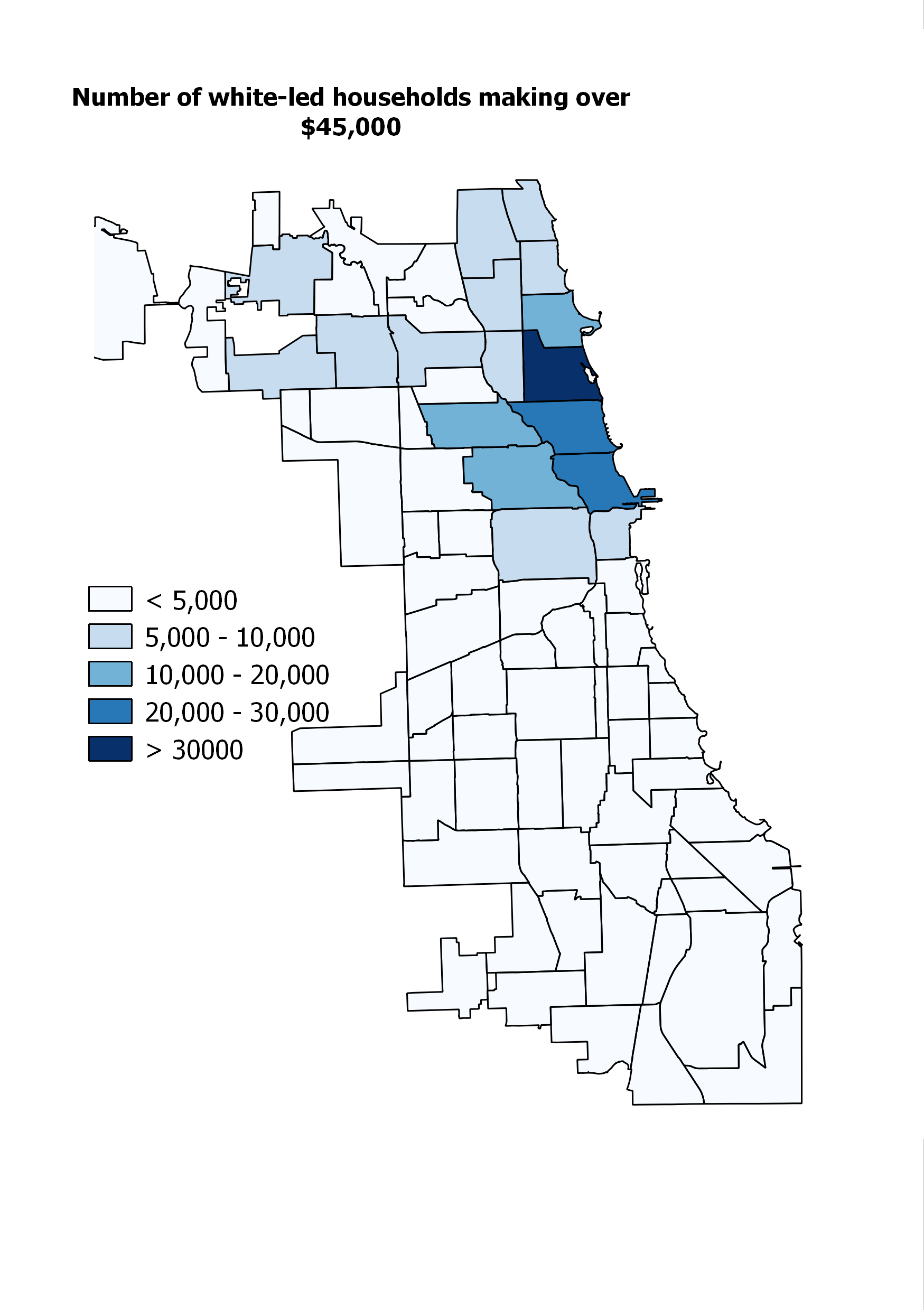
Anyway, this post is now long enough: I have more to say, but I will put it off to another time. I’ll leave you with two final maps: versions of map #1 above for Latinos, whites, and Asians. They’re fairly self-explanatory, but suffice it to say that most of this post could be rewritten, with only minor edits, to apply to Chicago’s Latino middle class as well.

L45tot

W45tot

A45tot

Two in a row

Over at Streetsblog, I have an article about how Chicago’s land use laws and design practices mean the city doesn’t get nearly as much out of its transit infrastructure as it might. In this instance, it’s about the Orange Line, but it really could be about any number of places. On the list I keep of potential posts here, “Oh my God Metra” has been staring at me for several months. Do you ever go to any of the suburban downtowns around Metra stations that haven’t been allowed to grow since 1920, forcing people and jobs out into the transit-dry hinterland? Does it make you cry?

Redlining: A Clarification

Friend of the blog Ted Whalen asked me this on Twitter after my last post:

Good point. If you look at the redlining map I posted, you’ll see that virtually all of the city (at least, what I clipped – you can see the full map here) is under some kind of mortgage insurance restriction, and a good deal of it is “redlined” – meaning the federal government refused to insure any mortgages of any kind. Even neighborhoods that today are quite well-off, including large parts of Old Town, Lincoln Park, and Wicker Park, were totally shunned.

A 1938 FHA map of Chicago. Note the loan guidelines for each color-coded zone on the bottom right.

For those of you who are unfamiliar with this history, you should go read Ta-Nehisi Coates’ essay. But the short version is that one of the most powerful and far-reaching New Deal-era policies, in terms of creating wealth among the working and middle classes, was reforming the way people bought houses. Prior to the New Deal, buying a house generally involved paying a huge lump sum up front, and/or taking on possibly multiple complicated, short-term, high-interest, generally unpleasant or financially dangerous loans. As a result, not very many people bought houses.

President Roosevelt changed that by creating federally-insured home mortgages that guaranteed certain buyer-friendly terms, including much smaller down payments and, crucially, 30-year payment periods. All of that dramatically lowered per-month payments, which were now affordable to the average member of the broad middle class. In essence, it was a massive subsidy program so that regular people could buy homes. Since homes, generally speaking, grow in value, and because they tend to be the single most valuable asset that most people have, it was also one of the single greatest generators of wealth in American history.

The problem for black people (and cities, and in a moral sense America itself) was that those subsidies were only available in certain areas. Basically, the federal government drew maps like the one above for the entire country, identifying neighborhoods that were too “risky” to insure loans in. One major indicator of “risk” was an aging building stock and “old-fashioned” urban design, which basically meant everything that today’s urbanists hold dear: mixed-use buildings, apartments instead of single family homes, etc.

But another major indicator was black people. Not some proxy for black people, or a sneaky back-door measure designed to exclude them: the federal government explicitly refused to insure any neighborhood that contained black people, or even neighborhoods adjacent to other neighborhoods that contained black people, for fear that soon some of the nearby black people might contaminate it. This was not a joke: in Origins of the Urban Crisis, Thomas Sugrue tells the story of a developer who wanted to build a white subdivision on the edge of Detroit in the 1940s. The problem was that the land he owned abutted a pre-existing black enclave, and the Federal Housing Administration was nervous about insuring loans in the area. To allay those fears, the FHA – the federal government – insisted that the new white development be separated from the black enclave by a six-foot-high concrete wall.

The wall, soon after it was built.
Amazingly enough, it still exists.

These policies didn’t begin to change until 1968, and private use of redlining wasn’t aggressively battled by federal law until the 1977 Community Reinvestment Act.

Anyway, the result of all this was that a) black people were excluded from the single largest wealth accumulation program in the history of the world to that point, and b) black neighborhoods – as well as many other inner-city areas – were systematically starved of capital that might otherwise have been used to keep buildings in a state of good repair. This was a major cause of their decline.

It’s notable, though, that lots of non-black neighborhoods were also redlined, as you can see in the map above. So if redlining was so important, why aren’t western Lincoln Park and Wicker Park facing the same kinds of problems as black neighborhoods?

I think there are a few answers to this question. The first is simply that up until relatively recently, they were.  Wicker Park, before it was the commercial heart of the Northwest Side, was a downtrodden and largely Latino neighborhood with a crime problem. Before that, wealthy Lincoln Parkers near the lake were sure that redevelopment and gentrification would never make it west of Halsted – to the areas that had been redlined.

The second is that those areas became revitalized as a result of an influx of mostly white people whose families had mostly chosen to bring them up elsewhere, largely in outlying urban or suburban neighborhoods where they had been eligible to buy federally insured homes and become solidly middle class or upper middle class, with home-based wealth as an anchor for that economic status.

The third is that while some white people were subject to redlining, the majority weren’t, which created the huge supply of relatively well-off white people who could bring resources back to places like Wicker Park. On the other hand, anywhere a black person successfully bought a home was, by definition, redlined, so a much, much tinier group of them made it to the comfortable middle class. (Even where black income matches white income, black wealth – which plays a huge role in absorbing shocks that might otherwise send a middle-class person back into economic instability, or financing investments in future earnings like college tuition – is usually tiny compared to their white income peers.)

The fourth and final reason is that because of a variety of economic and social factors, white people have been extremely hesitant to move to black neighborhoods. (Read: Federal policy made black neighborhoods, on average, more run-down and unattractive to the average home buyer, and white people also are racist about living around black people.) Combined with Reason Number Three – the tiny supply of wealthy black households – that means that even after redlining was abolished, there was no large middle-class cohort ready to swoop in and bring money back into black neighborhoods. Rather, the legacy of disinvestment was left to fester, and the opening of the broader housing market meant that middle-class blacks could leave for greener pastures. Which was, of course, great for them, but it also meant that even more capital was leaving those already capital-starved neighborhoods.

This may or may not be exactly what Ted was getting at – maybe I just should have tweeted a link to the full map – but it’s important stuff anyway. Read on.

Reparations

A 1938 FHA map of Chicago. Note the loan guidelines for each color-coded zone on the bottom right.

By now, certainly, you’ve heard of Ta-Nehisi Coates’ landmark piece on reparations in The Atlantic. If you haven’t read it, the essay is less about reparations per se – writing checks and so on – and more about grappling with and acknowledging the basic sources of American racial inequality.

I won’t quote any of it here; you really just have to read it. Certainly you should read the middle sections, in which Coates lays out, better than anyone I’ve seen, the established facts: how federal housing insurance policies, contract buying, and good old-fashioned violence, both mob and state-sponsored, led to the segregated, deeply unequal world we currently inhabit. If you think you already know the story, and you are not a professor of 20th century American history, you are probably wrong. Go ahead and read it.

Pete Saunders and others have already said it better than me, but this is all central to the American urban story: not just if you care about housing disparities and the racial wealth gap, but if you’re interested in urban design choices that were made in and around inner city neighborhoods; or if you’re interested in why so many urban neighborhoods were locked out of loans to fund rehabilitation and reconstruction of aging buildings, condemning them to decline and setting the stage for gentrification once the artificial barriers to development were removed.

The bottom line is that, to a great extent, we don’t have to wonder about why Chicago is so segregated, and whether it matters. The research has been done. The answers, as Ta-Nehisi Coates likes to say, are knowable. And we all owe it to ourselves to know them.

The author of “Sprawl” returns

Generally speaking, I find the kind of broad “Cities: Yea or Nay?” culture-war debates pretty exhausting and pointless. And it is, for the most part, a culture war, fought by people who disdain or feel threatened by the social influence of others. Data point: the subhed on Robert Bruegmann’s recent op-ed in Politico, which reads: “Why urban yuppies have it all wrong.” It’s a tempting rhetorical trap, because so many people have chosen sides – or have had their side chosen for them – and because reducing transportation policy to a culture war allows everyone to feel like all they need to know about it is their own personal experience and feelings. It’s also, obviously, a totally symmetrical phenomenon: for every “urban yuppies” jab there’s an urbanist who makes some throwaway reference to suburbanites being fat, or rich, or whatever. It’s all very stupid, and as a general rule we should all stop judging each others’ choices. (We should also be more aware of the extent to which people don’t get to choose what kind of community they live in.)

If you want to live in a weird giant circle, that’s cool.

Anyway, I clicked on and read Bruegmann’s piece mainly because he’s the author of Sprawl: A Compact History, the reading of which I attempted to liveblog last fall. (See parts one, two, and three.) And I’m writing something about it partly because I’m too busy to write the longer thing I’ve been working on for a while, but also because I think there’s a really basic flaw to the column that’s both extremely important and not at all obvious to the casual reader.

Basically, Bruegmann’s argument is that sprawl is fine – good, even – because car travel is more efficient, timewise, than public transit, and so Atlanta shouldn’t be worried about its recent designation as the most sprawly city in the country. It certainly shouldn’t attempt to fix its problems with sprawl and congestion by building more public transit:

In any case, the remedy for the problem of traffic congestion is not some massive transit-building program… Atlanta, like virtually every American city, would probably benefit from an expansion of the transit system, particularly to accommodate those who cannot, for one reason or another, drive. Even a major expansion, however, is unlikely to alter in any fundamental way the fact that most people except for those traveling to or from a few very dense nodes are going to do most of their travel by private automobile because in greater Atlanta, as in greater New York or greater Paris, the automobile is simply so much faster and more convenient everywhere except at the very center. [my emphasis]

This is a really remarkable paragraph for a person who is an emeritus professor of urban planning to write, and then publish, without immediately requesting a retraction or addendum or something.

The reason, if you think about that bolded part for a just second, should be pretty clear: what Bruegmann is referring to as “the very center,” where “the automobile is simply so much faster and more convenient,” varies a crazily huge amount between New York, Paris, and Atlanta, both in absolute size but also more importantly as a proportion of the entire metropolitan area. That’s obvious to anyone who has been to these cities, or is even casually familiar with them, but we can get a pretty good estimate of how big each “very center” is by looking at each metro area’s mode share: the percentage of people who choose to take public transit to work. Presumably, after all, people choose transit mostly because it’s the most efficient way to get where they’re going, with some consideration also for the fact that it saves a ton of money.

In the Atlanta area, about 3.7% of people take public transit to work; in the New York area, it’s about 30%. Paris is skewed somewhat because a huge percentage of people walk, but the drive-transit split works out to about 67-33. So we can very roughly estimate that the “very core” makes up, respectively, 4%, 30%, and 33% of these cities.*

Why the huge difference? Because a much larger percentage of the New York and Paris metropolitan areas are built at a reasonably dense, pedestrian-friendly scale where it makes sense to walk to the nearest bus or train stop, and where, when you get off that bus or train, you are likely to be able to walk to your job without too much trouble, either. In those cities, what Bruegmann refers to as “a few very dense nodes” make up, in fact, a continuous fabric of urban neighborhoods that are home to a huge percentage of the metro area’s residents.

In other words, Bruegmann forgot to talk about land use. At all. He forgot to mention that Atlanta, like basically everywhere else in the country (including metropolitan New York!), has basically made it illegal to build neighborhoods that resemble the transit-friendly nodes that, in Atlanta as elsewhere, are some of the most popular parts of the metropolitan area. As a result, as greater Atlanta has grown over the last few decades, it has failed to produce the kind of neighborhoods that allow people to choose not to drive, regardless of the quality of the public transit network.

Midtown, an attractive neighborhood with a thriving retail, restaurant, and housing scene, as well as a decently-used MARTA station, is one of the only parts of the Atlanta region that has been allowed to develop like this.

Which makes the whole finger-wagging at urbanists pretty silly. It may be the case that Atlanta needs more roads; I don’t know. It seems very clear – as Bruegmann himself admits, pulling the kind of rhetorical underhandedness that bugged me in his otherwise thoughtful book – that Atlanta needs better public transit. But without spending hardly any money at all, it could make what transit it already has much more useful simply by changing its land-use laws and letting people build more housing and jobs around major bus and rail lines.

It’s a measure of just how invisible land use policy is, though, that Politico would publish an op-ed on urban form and transportation choices without thinking that it needed to spend a single word on the subject. It is my hope that one day this will not be possible.

* Obviously the Paris number is ridiculously low, since it’s unlikely that the 40% of people who walk, if they had to choose between driving and transit, would mostly choose to drive. But whatever, the broader point stands.

From the comments: Black-Latino-white segregation in NYC

This is too good not to make a separate post: commenter Neil, or “nei,” on some of the historical differences in racial segregation between NYC and Chicago. Read it first. I add a few thoughts at the end.

Talk to Me Like I’m Stupid is working!

***

I’m going to a add a few comments on NYC that might be insightful even though they’re a bit of a nitpick. First, I’m not sure if this a good assumption:

But in New York, black neighborhoods have become significantly mixed, in particular with people of Hispanic descent.

You’re assuming those neighborhoods were entirely black at one point and then hispanics came later for some reason. I don’t think that’s a good assumption, I’d guess they arrived at roughly the same time. Large-scale migration of hispanics into NYC started mainly in the 50s, and was mostly Puerto Ricans, looking at wikipedia numbers it looks like the Puerto Rican influx was slightly earlier than the black migration, which continued into the 60s and later. The poorest Puerto Ricans settled in the some of the same areas as blacks. The South Bronx was roughly equally hispanic (Puerto Rican) and black around 1970, today it’s about 2/3rds hispanic but with a more diverse mix of hispanics. The housing projects also become dominated mainly by blacks and Puerto Ricans, though some projects are mostly blacks and others mostly hispanic, though I suppose. Hispanics average significantly lower income-wise than blacks in NYC, and NYC Puerto Ricans tend to below average income-wise among NYC hispanics, I’d guess Puerto Ricans were poorer than blacks then, too. Unskilled, discriminated against with the added difficulty of a language and cultural barrier. The many that had little money moved to the cheapest and worst neighborhoods the city had to offer, which often had a large black population. In many ways, back then, it makes sense to group hispanics and blacks together, especially pre-1980. But…

It appears blacks triggered faster “white flight” than Puerto Ricans. Many Puerto Ricans lived amongst blacks, but there were many more mixed white & Puerto Rican neighborhoods than white & black neighborhoods. For example, Williamsburg, Brooklyn pre-gentrification was mixed Puerto Rican and white (mainly Italian-American); still has some Puerto Ricans left. I think there were a number of other similar neighborhoods, but not so many stable mixed white-black neighborhoods. If you look at sites with old maps by race, such as socialexplorer.com (you’ll need the professional edition), the black population was far more concentrated than the hispanic population. Looking through by decade, you can see census tracts near a black neighborhood shift from mostly not black to mostly black. Want to guess which neighborhoods would have a quick decrease in white population? Check the black population map a decade before, areas adjacent would lose whites. Hispanics weren’t as segregated, which suggests that white flight was more of a racial than just an economic thing. Violent crime rates were higher among the black population, but in the late 70s/early 80s the hispanic/black difference was small, suggesting both populations were equally “ghettoized” in some sense, but fear of blacks seemed to cause more white flight than fear of hispanics.

Hispanic Murder rate dropped more than blacks, probably partly from heavy immigration starting in the 80s onward as well dismantling of drug gangs. 2011 rate was 1.4/100k for whites, 5.9/100k for hispanics, 14.6 for blacks and 1.5 for Asians.

Here’s a screenshot of a map of black population in NYC, 1970 [didn’t take a screenshot of a similar map for hispanics]

Chicago looked very different in 1970:

both from socialexplorer. It appears the equivalent of the South Bronx in Chicago in the 70s/80s would have been entirely black, rather than mixed black-hispanic. From what I can tell “white flight” in NYC came in two types:

1) Sudden very quick transformation from mostly white to minority. Usually more often from an influx of blacks then hispanics, and occurred in the poorest white neighborhoods, but generally mainly by near an increasing black population (block busting). Usually had white flight in the 60s or early 70s. South Bronx, Northeast Brooklyn are the best examples.

2) Gradual decrease of white population, starting later maybe in the 70s. Younger generations of whites slowed moved away, I heard them being described as “grandma neighborhoods”, since the non-transplant whites are older. They have often have some white population left, and a large immigrant population, but almost no black people (sometimes every possible race besides black). Southern Brooklyn and a lot of Queens are good examples of these places. While they were majority white, blacks were often discouraged from moving in by implied threats of violence.

Here’s an odd pattern. The three blackest zip codes in NYC are actually well off by city standards.

Top on the list (zip code 11411) has a median income of $81k/year, median home price of $404k. 93% black, 38% foreign born. Random streetview:

cambria

My guess is it’s too expensive for poorer hispanics (mostly owner-occupied homes), and whites or middle-class hispanics see little reason to move there, while some middle-class blacks want to move to a nice black neighborhood. Of course it was white at one, a bunch of synagoues in the area stand out as an odd relic, a couple have been bought by churches. Again, the white flight must have racial rather than economic as it’s not really any poorer than white neighborhoods in that area of Queens/Nassau.

The black population of NYC has a large immigrant contingent, but instead of black immigration breaking down segregated neighborhoods, it helped keep their setup. Since 1980, the black population has had a large domestic out-migration with the black numbers balanced by black immigration (mainly from the Caribbean but also from Africa). I saw numbers saying in 2000, 40% of NYC’s black population was either foreign born or had one foreign born parent. Most black immigrants moved to existing black neighborhoods, keeping the same segregation pattern. One interesting exception is some neighborhoods in Queens, there’s a section that’s mixed asian-black-hispanic. The largest black area of NYC [Northeast Brooklyn, with a larger black population than South Side Chicago] hosts the West Indian parade annually (maybe the city’s largest parade).

There are a number of neighborhoods in NYC that experienced white flight that have no black people. Sunset Park, Brooklyn has few white people, it had large-scale white flight around the time of de-industrialization around 1970. Puerto Ricans replaced the exiting whites, but no blacks. Today, western half of it is hispanic (mix of Puerto Rican and Mexicans), the eastern half is Chinese. The switch between the two groups happens in about a block, it’s a bit jarring. Continue east further, and it’s almost entirely Hasidic Jewish (Borough Park) with another quick transition. Almost no blacks today in any of those places. Washington Heights switched from White to Dominican rather quickly, you have it labelled as <10% black, though it has plenty of black hispanics.

***

Daniel again: It actually occurred to me when I was writing the original post that I didn’t know when the integration of blacks and Hispanics happened in NYC, and I’m glad someone set me straight about that. It’s an interesting point, although there has to be a much longer and more complicated story about why they ended up together: I guess maybe the lateness of arrival of Chicago’s Hispanic community? Or were Mexicans (the largest Latino group in Chicago, by far) less inclined to live in black neighborhoods than Puerto Ricans for some reason? Or were New York’s black neighborhoods somehow more attractive?

I did know about New York’s black community’s large foreign contingent, which really doesn’t have a parallel in Chicago. Chicago’s Caribbean and African immigrants are much fewer, but they also tend to move to the North Side’s small black communities in Uptown, Edgewater, and Rogers Park, rather than the main segregated black neighborhoods on the South and West Sides. I don’t think there are any segregated black community areas in Chicago that are more than one or two percent foreign-born.

In other ways, this description is very applicable to Chicago.

The distinction between rapid and slow white flight, for example – although the vast majority of cases with black neighborhoods were rapid, there’s been some slower white flight – and lots of “Grandma neighborhoods” – on the Southwest Side, where Latinos and Asians have been replacing whites for ten or twenty years.

The distinction between “racial” and “economic” white flight, I’m not sure I fully endorse, but it does complicate the narrative somewhat to point out the places where black newcomers actually outranked their would-be white neighbors economically, but the whites left anyway. That also has a few parallels in Chicago – Calumet Heights, I believe, and a few other places on the far South Side – places that are solidly middle class, but are still shunned by non-blacks.

Anyway. Thanks, Neil, for this.

How segregated is New York City?

Update: I wrote this in the comments, but several people have asked about it and not everyone makes it down there: this post focuses on white-black segregation because that, for various social and historical reasons, has been by far the most significant geographic separation in American cities, certainly in the Midwest and Northeast. But by far the second most significant separation – white-Latino segregation – is also very extreme in New York. The same Census analysis that found NYC was the second-most-segregated metro area in terms of white and black people found that it was the third-most-segregated metro area in terms of white and Latino people. That’s obviously not the end of the story either, though. If you know about or are curious about some other aspect of segregation, leave a comment.

***

The online reaction to the recent reports on racial segregation in New York state’s public schools reminded me, yet again, that most people think of New York as an integrated city, and are surprised or incredulous when that impression is contradicted.

This is somewhat jarring, since virtually every attempt to actually measure racial segregation suggests that New York is one of the most segregated cities in the country. This University of Michigan analysis of 2010 Census data, for example, suggests that New York is the second-most-segregated metropolitan area in the U.S., exceeded only by Milwaukee, and that about 78% of white and black people would have to move in order to achieve perfect integration. (Chicago’s corresponding number is just over 76%, good enough for third place.)

Why is this so surprising? One obvious reason, I think, is that most people’s conception of New York is limited to about 1/2 of Manhattan and maybe 1/6 of Brooklyn, areas that are among the largest job and tourist centers in the world. As a result, they attract people of all different ethnic backgrounds, especially during the day, even if the people who actually live in those areas tend to be monochromatic. Imagine, in other words, trying to judge racial segregation in Chicago by walking around the Loop and adjacent areas: you would probably conclude that you were in a pretty integrated city.

But it goes beyond that, I think. Segregation in New York doesn’t look like segregation in Chicago, or a lot of smaller Rust Belt cities. For one, there just aren’t very many monolithically black neighborhoods left in New York. Here, for example, I’ve highlighted every neighborhood that’s at least 90% African American:

NYB90

Were we to do this in Chicago, half the South and West Sides would be lit up. But in New York, black neighborhoods have become significantly mixed, in particular with people of Hispanic descent. This is a phenomenon Chicagoans are used to in formerly all-white communities – places like Jefferson Park or Bridgeport, which as recently as 1980 were overwhelmingly white, now have very large Latino and Asian populations – but in New York, it’s happened in both white and black neighborhoods.

That said, white folks in New York have still on the whole declined to move to black areas, except for some nibbling along the edges in Harlem and central Brooklyn. That means that instead of measuring segregation the way we might in Chicago – by looking for very high concentrations of a single ethnic group – it makes more sense to look for the absence of either white or black people.

Here, then, I’ve highlighted all the places where white people make up less than 10% of the population:

NYW10

It’s a lot. And, correspondingly, here are all the places where black people make up less than 10% of the population:

NYB10

It’s also a lot. And if we put the two maps together, we see that these two categories cover the overwhelming majority of NYC:

NY10

The same pattern holds pretty well if we lower the threshold to no more than 5% white or black:

NY5

And there are even a significant number of areas that are truly hypersegregated, with fewer than 2% of residents being either white or black:

NY2

Because I now love GIFs, here’s a summary GIF.

NYSeg

What does all this tell us? For one, it confirms graphically what the Census numbers suggested, which is that the median black New Yorker lives in a neighborhood with very few white people, and vice versa.

But it also suggests a racial landscape that looks different from that of Chicago, and lots of other American cities, in important ways. In particular, where Chicago has a relatively simple racial geography – white neighborhoods at various levels of integration with Hispanics and Asians to the north and northwest, black and Hispanic neighborhoods to the south and west, with only a few small islands like Hyde Park and Bridgeport that break the pattern – New York’s segregated neighborhoods form a more complex patchwork across the city. That means that while a North Sider in Chicago might go years without having to even pass through a black neighborhood, lots of white New Yorkers have to get through the non-white parts of Brooklyn or the Bronx to reach job and entertainment districts in Manhattan or northern Brooklyn.

I imagine that structural-geographic fact, combined with New York’s relatively high level of black-Hispanic integration, goes a long way to explaining my anecdotal experience that white New Yorkers tend to be less ignorant and scared of their city’s non-white neighborhoods than white Chicagoans are of Chicago’s. (There’s some interesting research that suggests white people tend to be more sympathetic to brown people, and their neighborhoods, than black people and theirs.) There’s also, of course, the fact that Chicago’s segregated non-white neighborhoods tend to have much higher violent crime rates, and much more modest business districts, than New York’s, although that’s likely both an effect and cause of their relative isolation.

All of this is another reason that I’m kind of excited about the growing entertainment and shopping district on 53rd St. in Hyde Park, since the more that the South Side has “neighborhood downtown” strips that draw people from across the city, the more likely North Siders and suburbanites are to travel through the black and Latino neighborhoods that surround them, observe that many of them are actually quite nice, become less committed to shunning them, and thus contribute less to the social and economic dynamics that have created the institution of the ghetto, and the poor job prospects, failing schools, and high crime rates that accompany it.

In conclusion: New York is super segregated, but the numbers aren’t everything.

Also, let me have another Talk To Me Like I’m Stupid moment: suggestions for books about the racial history of New York? What’s the equivalent of Making the Second Ghetto or Family Properties? I’ve already read Caro’s Moses book.

Something is missing here…

One goal of beating the housing supply drum over and over again on this blog is to get to the point where general interest Chicago media outlets understand the relationship between new development and housing prices and explain it to their readers. Which is why I was incredibly excited yesterday to see a headline in Crain’s called “Why Rents Are Rising on the North Side.”

And why are they? Because there’s no new supply in neighborhoods like – surprise, surprise – Lincoln Park and Lakeview!

As more construction cranes sprout in downtown Chicago, they remain rarer in neighborhoods such as Lincoln Park and Lakeview. Stuart Handler likes it that way.

With few apartment developments going up in North Side neighborhoods, landlords like Mr. Handler have more freedom to raise rents than do owners of downtown high-rises, which are starting to feel the impact of a major construction boom that shows few signs of ebbing.

Incidentally, here is Mr. Handler’s photo in Crain’s:

 - Stuart Handler, CEO of TLC Management Co., steered clear of downtown Chicago. “I didn't want to battle it out with new high-rises.” He's glad he did.

So, um, all the social justice folks who think fighting development equals fighting gentrification, this old white guy in a suit sitting in front of a gold-plated fireplace just wants to say thanks.

Anyway, this is grade-A stuff so far, since it’s pretty rare for mainstream outlets – even business-oriented ones like Crain’s – to so directly make the link between a widespread shortage of housing supply and rising prices. I’ll be even happier when it gets in the Tribune, but I’ll take this for the moment.

But then the author gets to why, exactly, there’s so little supply in the neighborhoods and so much downtown, and it seems like there’s something missing:

Yet construction has been limited in the neighborhoods because it’s hard to find land for big projects, and rents in many places are not high enough to justify a new building, Mr. Kiser says.

In general, rents must hit around $2 per square foot, at a minimum, to justify the cost of a new building. Many existing structures on the North Side aren’t getting that, while downtown apartments are fetching $3 per square foot or more.

It may be true that there are fewer large empty lots in Lincoln Park than there are in, say, the West Loop, but anyone who’s taken a walk around knows that there are more than a handful of empty or dramatically under-utilized spaces. As for the idea that rents aren’t high enough: I’m not a real estate expert, but Zillow reports that the average rental price per square foot is currently at $2.07 in Lincoln Park. A number of other neighborhoods are quite close to an average of $2/sq. ft., which suggests there ought to be a fair number of spots that hit the magic number. Moreover, where huge empty lots have forced the issue of redevelopment – at Children’s Memorial Hospital, for example, or the New City lot near North and Clybourn – private developers have been more than eager to build, and build big.

In any case, it’s remarkable that Crain’s did not see fit to mention, at least in passing, that a notable constraint on adding lots of supply to places like Lincoln Park is that it’s illegal to do so. Or that, unlike downtown, any building over four stories or so is subject to the veto of powerful and wealthy local residents who are opposed to any new development, often explicitly on the grounds that it might promote more affordable housing.

In conclusion: Lots more articles about the link between housing supply and housing prices, please, but don’t ignore the role of zoning next time.

Excellent news for Ashland BRT

Not to get too DC-tea-leaves-read-y here, but this is really excellent news:

EAST VILLAGE — A neighborhood group Monday night narrowly voted against the “bus rapid transit” plan for Ashland Avenue in its current form after months of debate.

“At the very least, it says to the city — the CTA, the Chicago Department of Transportation — they need to do additional planning,” East Village Association President Neal McKnight said of the 11-9 vote. (my emphasis)

[snip]

“I want to be aspirational,” [Association President] McKnight said. “I want [it] to be better than what they’re offering us, and I think that what they’ve offered us is kind of half-a**ed at this point.”

So the neighborhood from which the most vitriolic opposition to Ashland BRT has come had its formal vote, and only opposed the project by the narrowest margin possible. Moreover, only eleven people actually cared enough to come out and actually vote against it. Eleven people. The idea that there is a huge groundswell of strong opposition to BRT was dealt a really serious blow here, especially given that these sorts of public forums are almost always dominated by people who are against whatever is being proposed.

Moreover, even the people who voted against the plan – like the association president, McKnight – explicitly asked the CTA and CDOT to come up with a new proposal that addresses their concerns, like left turns and side street traffic.

To summarize:

1. The most virulently anti-BRT neighborhood association turns out to be 45% in favor of BRT.

2. Given a chance to formally express their opposition to the project, a paltry 11 people showed up to do so.

3. Even the people who opposed BRT want to find a compromise and bring faster, more reliable bus transit to Ashland.

That’s pretty great news.