Out-of-state college graduates help define Chicago’s North Side zone of affluence

If you had to summarize the demographic changes in the Chicago metro area over the last 30 years in a single statistic, you could do worse than “suburban residents used to be more likely to have a college degree, but now city residents are more likely to.” From the Chicago Federal Reserve:

College Graduates of the Population 25+, 1990-2016

Of course, though these changes are taking place at a regional scale, their effects are especially visible because they have been concentrated—that is, the additional 20 percentage points’ worth of college-degree-holders living in the city have not spread themselves around, but have segregated in a growing but modest slice of the city, running roughly from the South Loop to Andersonville, and west to Logan Square. These neighborhoods have seen massive demographic and economic change in the last two or three generations, largely because of a massive influx of college-degree-holding residents.

Something I hear a lot of people talk about is where these people come from. Are they suburbanites? Moving in from Big 10 schools or Portland or DC?

Happily, the Census can tell us where people with certain educational attainments were born! So I made a series of maps about it.

First up: College-degree-holders who were born in Illinois. (Unfortunately, Census data won’t let me get more specific than that—so these are people who could have been born in the city of Chicago, the suburbs, or even downstate.)

IL Born College

Importantly, these maps show the percentage of all residents who are both college graduates and born in Illinois. In other words, in the tracts colored darkest purple, more than half of all residents both have a four-year college degree and were born in Illinois.

In this map, the North Side’s “zone of affluence”—that belt stretching from downtown several miles up the lakefront, up the Blue Line, and west to about Ashland—is clearly visible. But it’s highlighted at a similar or even lesser intensity than much of the northern, western, and southwestern suburbs—as well as other city neighborhoods like Edison Park on the Northwest Side, or Beverly and Morgan Park on the Southwest Side.

What about people born in the U.S. but outside Illinois?

US Born College

This map looks much, much more like the “zone of affluence” that I usually think of. An intense, tightly drawn oval from downtown onto the North Side; Hyde Park; the North Shore suburbs; Oak Park; and the suburbs along the BNSF Metra line from Hinsdale to Naperville.

But the city’s North Side zone really stands out. In places like Lincoln Park, Lakeview, and Wicker Park, 30-50% of all residents are college graduates who were born in the US outside Illinois.

It’s also clear that US-born, non-Illinoisan college graduates spread out across the city and metropolitan area much less than Illinois-born college graduates. That makes sense—”people born in Illinois” includes people who grew up in every neighborhood in the Chicago area, and you would expect many of them to stay near where they grew up. Meanwhile, people moving from other parts of the city are likely to know less about the region, and follow recommendations about where to live from their social circles, who are also likely to be from outside the region, leading to clusters. Maria Krysan’s and Kyle Crowder’s work on the way imperfect information and “choice sets” shape patterns of segregation seem relevant here.

Finally, what about foreign-born residents with college degrees? We’d expect them to cluster as well—but do they do it in the same places?

Foreign Born College

In short: Not really! In fact, the North Side zone of affluence is almost *totally gone*. There is a central city cluster, but it runs from the Loop to the South Loop and to northern Bronzeville, with another spike in Hyde Park, and another one on the West Side near the Medical District and UIC.

But there are also many suburban clusters—clusters that are not the same as either the Illinois-born or US-born clusters. The northern inland suburbs, like Skokie or Des Plaines, show up strongly; many of the western suburbs that are strongest in the other categories, like Hinsdale or Glen Ellyn, are barely visible, though Naperville is clearly a hot spot.

Are TIFs taking money away from the city?

I co-wrote this post with Amanda Kass, and it is cross-posted at her blog.


Tax increment financing–or TIF–made the news this summer with the release of a report by Cook County Clerk David Orr. The Tribune covered the report with the headline “Nearly a third of city property tax collections diverted into special taxing districts.”

But do TIF districts really “divert” hundreds of millions of property tax dollars that would otherwise go to the city or its schools? The short answer: mostly not. But to understand why not, and why “mostly,” you’ve got to understand how TIF and property taxes both work.

This post is a short tour of that world. (There’s some additional, optional reading at the end if you can’t get enough.) The aim isn’t to provide technical knowledge of a complex economic development program, but to help Chicagoans to participate in the debate over how their city funds basic services, and what kind of process is used to make those decisions.

How Do Property Taxes Work?

Before diving into TIF, a brief explanation of how property taxes work is needed. A caveat though: this is an overview of how one part of the property tax process works generally, and not necessarily how homeowners experience it. For example, we’re leaving out a lot of important aspects like the assessment and appeals processes. In real life there are also many overlapping taxing districts, but we’re discussing things in terms of a singular government.

For the purposes of this post, the first thing to understand is that property taxes don’t work like income or sales taxes. With a sales tax, a government sets the tax rate, and then apply the rate to whatever you buy, and that determines how much revenue it gets.

But property taxes go the other way: First, the local government determines how much revenue it will receive.* This amount is called the “levy.”Then it works backwards to figure out what tax rate it needs to get that amount of revenue, given the total value of the properties it can tax.** As you’ll see, this “backwards” way of setting the rate (and some added complications) is really important when a TIF is created.

(If you want more details check out the Notes at the bottom of this post.)***

How Does TIF Impact Property Taxes?

Tax increment financing is meant to be an economic development tool. When a city creates a TIF district, it caps the amount of property value in the district that can be taxed through the regular property tax process. The property value at the time a TIF district is created is known as the “base value.” After the district is created, any growth in property values above the base (be it for existing properties or new construction) is called the “increment.”

Now, remember how property taxes work: a government chooses the amount of revenue it will collect, then divides that by the total amount of property value it can tax to calculate the tax rate. The wrinkle is that while only the base value is used to determine the tax rate, the government then applies the rate to both the base value as well as to the increment values. Tax revenue from the base value goes to the government’s regular budget, while taxes from the increment goes to separate TIF accounts.

So what does TIF mean for a government? In general, TIFs won’t change how much revenue a government receives because governments set the levy (how much revenue they will receive), and the rate is automatically adjusted to generate the levy amount. Incremental property value is not part of a government’s taxable base—meaning the government needs to apply a higher rate to get the same levy amount from the smaller taxable property value available to it. Because of this TIF districts generally end up increasing the property tax rate even for people who don’t live in a TIF. And because the property tax rate is applied to both the base value for the levy and then also applied to the increment, TIFs cause more total property taxes to be collected than if the TIFs didn’t exist. Because of this TIFs function somewhat like a tax rate hike.

Do TIFs Siphon Money Away from the City and Schools?

At the beginning of this post, we said the short answer was “mostly not,” and now you can see why. Property taxes begin with the levy—the total amount of revenue a government wants to raise—and work backwards from there to set the rate. That means that when a TIF district limits the total amount of property value that local governments can tap for their levy, the tax rates end up being higher than they otherwise would be so local governments get the same amount of money. Then that higher rate is also applied to the “increment” property values in TIF districts, with the resulting tax revenue going to the TIF account.

The bottom line: For the most part, TIFs increase the total amount of property taxes paid, rather than diverting them from regular budgets into special funds.

We say “for the most part,” though, because for Chicago Public Schools (CPS), TIFs do divert some funds from the regular budget to special funds.

That’s because unlike the City of Chicago—which can set its property tax levy at whatever amount it wants—CPS  is constrained by Illinois’ Property Tax Extension Limitation Law (PTELL). In general, PTELL limits the amount CPS can increase its levy by the lesser of 5% or inflation (CPI).

But there’s a loophole: new construction is not subject to the PTELL cap, and thus a boom in new construction can generate increased revenue for CPS. But TIF districts can get in the way of that loophole by capturing the property values of new construction in their increments, and holding them off-limits to CPS. So if TIF were to end tomorrow, CPS could increase its property tax levy beyond the current PTELL maximum thanks to the value of new construction.

But PTELL adds another wrinkle, too. When a TIF district expires, incremental value belonging to existing structures is not subject to the PTELL cap, either. Unlike new construction properties, which CPS would have been able to tax above the PTELL maximum the whole time if not for the TIF, increment value from existing buildings becomes a “bonus” only if it is part of an expiring TIF district. In other words, though TIF districts can reduce CPS’ property tax levy while they exist, once they expire, CPS might be able to receive more property tax revenue than if the TIF had never existed.

What’s the net impact of all of these factors? That is very difficult to quantify, for several reasons. One wrinkle is that some TIF funds have been used to pay for school infrastructure projects–ranging from building new schools to projects necessary for schools to be compliant with the Americans with Disabilities Act (see also pages 144-146 in CPS’ latest financial report). Another is that in addition to the property tax, CPS is funded by state aid, and to some extent the amount of that aid depends on the size of CPS’ property tax base. The larger the base, the less state aid.


Last, it’s also possible that new construction and increases in property values wouldn’t have taken place without TIF, and thus CPS wouldn’t have that property wealth to tax. Whether TIF is an effective economic tool is debatable, and the academic research on this question has produced mixed answers. We’re not wading into the effectiveness (or merits) of TIF in this piece, and if you want to learn more about that topic see our suggested reading list.   

Suggested Reading

University of Illinois at Chicago Professors David Merriman and Rachel Weber have both extensively studied this topic, and their CVs each highlight their numerous TIF related publications. We’re linking to some of their readily available TIF publications here (as well as some other items), but this is not an exhaustive list of their work–most importantly, we’re not linking to their academic articles because those aren’t readily accessible.


Notes:

* The amount of money taxing districts can get from the property tax may be limited by the Property Tax Extension Limitation Law and/or tax rate limitations. Last, taxing districts’ aggregate levy is made up of specific levy line-items, and different restrictions apply to different line-items.

** The are multiple public entities involved in the property tax process. Taxing districts set their levies, but the County Assessor and Clerk (which are separate offices) play important roles in determining property values and any applicable limitations to the amount of property taxes a taxing district can levy. Last, actual tax collection is done by the County Treasurer.

***A first complexity of the property tax system has to do with property values. A homeowner’s tax bill is based on its assessed value, equalization factor, and any applicable exemptions. The Cook County Assessor’s office is in charge of determining property values. The main point is that there are a bunch of steps between a property’s market value and the property value that’s ultimately subject to taxation.

There are also a lot of taxing districts in Cook County (school districts, townships, cities, mosquito abatement districts, special service areas, etc), and each one sets its own levy. The impact of all these different taxing districts and their different boundaries means that two identically valued homes that are in close proximity to each other may have different tax bills.

Once the levy and property values are both set, the Cook County Clerk’s office determines the rate. Tax bills are then sent out, and subsequently paid in two installments.The Cook County Clerk’s office has a nice graphic explaining this process.

Again, the big thing to know about property taxes is that the tax rate is a function of the levy and property values. The general formula for property taxes is as follows:

Levy/Total EAV = Rate

So if the total EAV in a given jurisdiction was a million dollars and the local government wanted $1,000 the property tax rate would be 0.1%. If total property value was less than a million dollars then the tax rate would be higher, and vice-versa. If an individual’s home had an EAV of $50,000, his/her property tax bill would be $50 (0.1% * $50,000).

The Sides: race

Lynda Lopez made some comments a few days ago about misperceptions of the whiteness of the North Side that got me thinking:

Screen Shot 2018-02-26 at 9.53.57 PM

Even for people outside Chicago, the “sides” are heavily racially coded: North is white, South and West are black. (Curiously, I’m not sure that any are especially coded as Latino, despite the large Latino population in the city.)

But these codes are, in fact, not terribly accurate. The North Side is certainly white-er than the South or West Sides, for example—but it’s barely over half non-Hispanic white according to recent American Community Survey data.

Anyway, this got me thinking about what these actual numbers are, and how they’ve changed over time. Thanks to Rob Paral, getting community area-level data going back to 1930 is extremely easy. Rolling that up into “sides” doesn’t take much more work—just some tough decision-making where it’s not obvious how to divide things up. So: consider this the first of a sporadic series investigating what the “sides” of our city actually look like.

First up: race and population.

Note: Data is limited by what the Census asked for at different points; adding things up, it’s clear that there are big shifts from “Other” to “Latino” (actually asked as “Spanish name” at first) and from “Other” to “Asian American” when those categories become available.

1. The South Side

For my purposes, the South Side is everything south of the Stevenson expressway/the south branch of the Chicago River. It includes, then, both clear “South Side” neighborhoods like Bridgeport and Englewood, but also “Southwest Side” neighborhoods like Brighton Park and Ashburn.

Screen Shot 2018-03-02 at 10.57.35 PM

2. The West Side

The West Side here is everything north of the Stevenson, west of the Chicago River, and south of North Avenue, except for a) West Town, and b) the Near West Side.

Screen Shot 2018-03-02 at 11.04.48 PM

3. The North Side

The North Side here is everything above North Avenue, but also West Town.

Screen Shot 2018-03-02 at 11.14.52 PM


2017: A year in frustrating writing

This year, the vast majority of the writing that I did—as of this exact moment, something like 28,000 words of it—never got published. That’s because those words are building towards a book, which will be published in 2018. (The Battle of Lincoln Park: Urban Renewal and Gentrification in Chicago. Coming October 2018 from Belt Publishing. More details soon!) The process of producing those words has been enormously challenging, and rewarding, and has introduced me to archival research (which is wonderful) and a kind of longform storytelling that is bending and twisting my brain into all sorts of shapes it has never held before.

At the same time, though, it’s been quite frustrating. Between blogging, freelancing, and working for City Observatory, I’ve become quite accustomed to an idea-conception-to-publication-and-feedback timeline of anywhere from a couple hours to a couple weeks. Doing such an enormous amount of work—and learning such an enormous amount—without being able to share it for a year and a half has left me feeling lonely and insecure. Mostly, I’ve dealt with that by sharing snippets of archival material on Twitter, as well as some less dignified attention-seeking.

But also, looking back, I did get to share some stuff this year. Here are my favorites.

1. What happened to CTA buses in November 2013?

A long-running hobby horse of mine—declining CTA bus ridership—turns up a statistical artifact that suggests the headline numbers may not be quite what they seem.

screen-shot-2017-01-02-at-12-24-20-am

2. One I wish I had had time to pursue more: Where did Chicago’s vacant land come from?

A “hm” post led me to late 70s arson epidemics and historic aerial photos of Englewood.

3. A short ode to the four plus one.

screen-shot-2017-01-11-at-7-52-58-pm

4. How the geometry of density affects our perception of “suburban character.”

In Jefferson Park, most land is taken up by single-family homes. But most people live in multi-family buildings. What does that mean about what kind of neighborhood Jefferson Park is, and what kinds of new buildings are “in character”?

streetscape2

5. Where the kids are

Mostly, they’re everywhere but the gentrified North Side. But there are signs that that pattern might be shifting slightly.

6. Changing coalitions in Chicago mayoral elections

From a data perspective, this was the toughest thing I did in 2017. It was a lot of fun. And it turns out that Rahm Emanuel and Richard Daley got elected on a very different set of electoral coalitions. The throughline: white folks.

ThreeCoalitions

7. Beyond the ‘L’ on the South Side

This is maybe the piece I’m most proud of in 2017. If you missed it, please take a read.

8. What does it mean to be Midwestern?

A review of two books for Belt Publishing at the Reader. It’s always exciting to be published in the Reader.

9. Nobody’s leaving Illinois

Well, that’s not true. But it turns out that it’s way fewer than you probably think. Our migration problems come from elsewhere, as I explored in this piece for CTBA’s Budget Blog.

Screen Shot 2017-09-09 at 3.47.52 PM

Illinois migration problems are basically all the suburbs’ fault

Screen Shot 2017-09-09 at 3.47.52 PM

At the CTBA Budget Blog, I wrote about that:

Historically, Chicago’s suburban collar counties have been the migration powerhouse of the state, hoovering up people from across the country and the world, while relatively few of those suburbanites ended up leaving. Cook County, meanwhile, saw huge net out-migration, as city dwellers moved to the suburbs. And the rest of the state hovered right around the break-even point.

The 2008 recession totally scrambled that old dynamic:

  • The suburban counties, which since the 1990s had been gaining 10 or more new migrants for every 1,000 residents, suddenly fell into the red, losing more movers than they gained by 2010.
  • Cook County, meanwhile, which just before the recession had seen a net loss of 13 migrants per 1,000 residents, improved dramatically. While it never hit positive territory, by 2011, it was actually seeing less net outmigration than the collar counties — a complete reversal of the usual pattern.
  • The rest of Illinois, meanwhile, remained roughly the same as it had been through the worst of the recession.

There’s also a bunch of other stuff, so you should go read about it. (If you haven’t been paying attention, Illinois media and maybe some other people have periodic freakouts about the fact that more people are leaving Illinois than coming here, which then gets used as a political cudgel by pretty much everyone, and it’s a boring and frustrating conversation, but it turns out that what’s actually going on is pretty interesting.)

Screen Shot 2017-09-09 at 3.50.22 PM

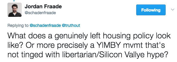
What is a left approach to housing in 2017?

Jordan Fraade asks:

Screen Shot 2017-05-11 at 6.10.14 PM

He then gives three good places to start: the Democratic Socialists for America-Los Angeles statement against Measure S; a short piece by Torrie Fischer on YIMBY socialism; and Rick Jacobus’ excellent column in Shelterforce last year.

As far as a sort of programmatic, what-do-we-do-now agenda, I think Jacobus pretty much has it covered. His big points:

  1. At the regional level, every piece of evidence we have suggests that additional housing absolutely helps to hold down the growth of housing prices. Growing regions that want to avoid big increases in the cost of housing need to build more housing.
  2. At the neighborhood level, the relationship is much more ambiguous. There need to be counter-market tenant protections because we can’t count on supply to balance demand in any particular location.
  3. Modern rent control seems not to have serious harmful side effects, but it also is only middlingly helpful in preventing displacement.
  4. So creating a large and growing stock of housing whose price is not set by the market—whether publicly or privately owned—is also important.

But I’m interested in exploring how Jacobus (or I) got here: what sort of left principles bring us to these conclusions, and where might we have made different decisions?

I’m going to start from what I think of as a kind of “soft socialism,” in which our default position is not to regulate a given economic activity, but our belief in egalitarian outcomes and in the tendency for markets to be coercive and destructive means we have a light regulatory trigger.

I’m also going to assume that treating being housed as a basic right is uncontroversial, and so government stepping in to provide assistance to whoever the market has left homeless (or severely rent-burdened) is a given.

Who, exactly, a truly free housing market would leave unhoused is an interesting question (about which I went around with Salim Furth, Stephen Smith, and others recently on Twitter), but is sort of unhelpful for the purposes of this post.

So instead let’s assume that the market optimists are right, and that basically everyone with a full-time job would find affordable housing in every metropolitan area if only housing supply weren’t restricted by zoning laws that prevented new construction and banned traditional affordable housing strategies like boarders and conversions of single units to multiple units. And let’s assume that people who can’t work, or can’t find work, are provided for, either with some kind of housing voucher or public housing. And let’s also assume that we can all agree on regulations to assure basic building safety and sanitation standards.

What, then, would be the progressive justifications for additional housing regulation? I can think of a few things:

Land is a quasi-monopolistic, unearned source of wealth and driver of inequality

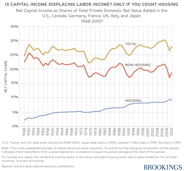
One reason to regulate is that even in a mostly laissez-faire environment, urban housing isn’t infinitely producible, and it certainly isn’t infinitely producible in a given location, and some locations are much more valuable than others, and people who find themselves in possession of land in the more-valuable location are therefore in a position to earn economic rents on their quasi-monopoly housing.

Moreover, as cities and economies grow, valuable urban land tends only to get even more valuable, and so housing ownership can be a major driver of wealth inequality. In fact, this seems to be the case in the real world.

Screen Shot 2017-05-11 at 7.14.50 PM

Of course, this isn’t really an argument for regulating the production of housing: In fact, the restrictions on construction that exist are only making housing in those locations more monopoly-like, and increasing inequality. But it might be an argument for seizing the unearned wealth that urban housing ownership generates, which you could do either with a confiscatory land value tax, or a kind of vast public community land trust.

Integration

Even if a free housing market could produce adequate affordable market-rate housing for all employed people, it’s extremely unlikely that it would produce adequate affordable market-rate housing for all employed people in all neighborhoods. And since public goods and public services like safety, jobs, schools, parks, and so on are to some extent provided locally, even a sort of loose “equality-of-opportunity” liberalism would be concerned about geographic segregation, either economic or along some other sort of line of privilege like race.

Screen Shot 2017-05-11 at 8.11.50 PM
Racial segregation in New York

Of course, this is also generally not an argument for restricting the production of housing: the evidence suggests that more restrictive zoning is associated with more segregation, not less. (And history suggests that is, more often than not, its intended purpose.) But it’s an argument for either more targeted subsidies, or public housing, to create a stock of low- and moderate-income housing in neighborhoods where the market won’t.

The moral right of occupancy

We also might believe that housing stability, the ability to choose not to move, is so important to many people—both in pragmatic ways related to the logistics of daily life, as well as in deeper, more sense-of-self-related ways—that we would want to prevent the market from forcing people to leave their homes, even when other affordable housing is available elsewhere.

This is also not an argument for restricting housing production per se, but it might have that effect if it prevents would-be developers from clearing tenants out of older buildings they want to redevelop. More directly, it may be an argument for some kind of rent control or targeted housing subsidy to people with quickly rising housing costs—or a guaranteed right of relocation to public housing in the vicinity of your old home.

Community stability

Beyond a concern about the housing stability of individuals, we might be concerned about the stability of communities.

This could take a number of forms. A loose version—a desire to allow social networks to keep their physical proximity to each other—might be satisfied by protecting each individual member of the social network, and so nothing beyond the section above would be necessary.

But a stronger form of community-based protections might be concerned about more than just the physical proximity of individuals. It might, for example, hold that for certain definitions of community, the built environment must be preserved as an important piece of the community. It might hold that a certain institutional environment is necessary, and therefore require restrictions on businesses and other local establishments. Most radically, it might hold that the community requires not just the presence of its members, but the absence of non-members—or at least, limited numbers of them.

These communitarian concerns are the ones that are most likely to call for restrictions on new housing. They’re obviously far more complex than my summary here, and in some cases—particularly the exclusion of non-community members—they open the door to profoundly troubling policy, and are on questionable (though not indisputable!) ground as policy informed by left principles. Though the word “community” is thrown around quite a bit in housing debates, specific rights to housing are generally put in individual terms. I think in many cases, though, the logic is communitarian, and further elaborating these ideas and principles could help shed light on why people end up where they do on questions of neighborhood development.


Of course, this is very far from an exhaustive list. I hope other people can add to it, or respond and critique it!

A South Side transit manifesto at South Side Weekly

Daniel Kay Hertz
There’s more where this came from.

Go read the whole piece here. You’ll have to click through for the many, many numbers and several maps, but the kicker:

The generations of transportation and development policy that treated people without cars as an afterthought, or elements to be actively discouraged, are simply another part of the weaponization of geography. It created a two-tiered transportation system that forced even many of those living in poverty to spend thousands of dollars to buy and maintain a car, or lose hours a day on increasingly disinvested transit services. Those who are physically unable to drive were left out no matter their financial situation.

Returning to a transportation policy that prioritizes the lowest-cost, most accessible forms of transportation obviously won’t erase Chicago’s deep inequalities. But it’s an important part of the path to a better city. In a big-picture sense, reinvesting in public transit reverses a profound kind of privatization of the city’s streets, and sends the message that the public sphere—the resources that are truly available to everyone—can be just as good, and as dignified, as the resources only available to those who can pay.

But more prosaically, a more accessible South Side, and a more accessible Chicago, means that when you want to go somewhere, you can do so faster, cheaper, and more comfortably. It means that more jobs, more grocery stores, and more parks and museums are a reasonable distance from your home. It means a more humane city, in ways big and small. Envisioning what accessibility might look like on the South Side is, hopefully, one modest step towards that kind of city.

Emanuel’s electoral coalition bears little resemblance to Daley’s

Data journalism has had a field day with national politics, turning crosstab mining and precinct shifts into an entire subgenre of human intellectual enterprise. It’s fun, until it’s exhausting, which is pretty soon.

But there’s much less to go on about local Chicago politics, which means I’m far from exhausted. To be sure, there’s been some good work: WBEZ’s dot maps of the 2011 and 2015 mayoral elections, for example; everything Scott Kennedy does at Illinois Election Data; more from WBEZ’s data Tumblr; and this long, but worth it, memo from the Illinois Campaign for Political Reform.

But I haven’t been able to find much that satisfactorily answers my biggest question about recent Chicago politics, which is: How different is the Emanuel coalition from the Daley one? That is, to what extent has Rahm Emanuel simply inherited the voters who kept Richard Daley in office for over two decades, and to what extent has he forged a different kind of voter base?

To skip to the answer: It’s, uh, pretty different.

ThreeCoalitions

Emanuel’s 2011 winning map looks very little like Daley’s map from his last election in 2007. Sure, both of them won the north lakefront—but that’s about where the similarities end. Daley’s coalition added to that a dominant performance on the Northwest and Southwest sides, as well as the Far South Side pockets of East Side, Beverly, Mt. Greenwood, and Hegewisch. Emanuel, by contrast, lost the Southwest Side heavily, split the Northwest Side, and lost all the Far South Side pockets that Daley won.

For anyone with a passing familiarity with Chicago demographics, this is clearly not so much about geography as about race. To put it bluntly: Daley won on a white-Hispanic coalition, while Emanuel won on a white-black coalition.

One other difference: The depth of the blue. Daley, in true Daley fashion, absolutely dominated in his base areas, frequently racking up 80 to 90 percent of the vote, and even in his weaker districts—that is, majority-black neighborhoods—got over 50 percent more often than not. Emanuel, by contrast, outright lost large areas of the city—almost always majority-Hispanic neighborhoods—and won much more modest victories in his stronger districts.

And then in 2015? Emanuel’s white-black coalition turned into a, um, white coalition. The black areas of the South and West sides that had narrowly supported him in 2011 turned reddish, along with the more integrated neighborhoods of the north lakefront, including Rogers Park and Edgewater. With the support of only one of the three racial groups that make up the overwhelming majority of Chicagoans, Emanuel was held to under 50% of the total vote, forcing a runoff.

The chart below is a different way of visualizing the same data. It’s actually two charts: For each of them, the vertical axis indicates the share of votes in each “precinct”—represented by the dots—won by Daley in 2007. The horizontal axis on the first chart indicates the share of votes in those “precincts” won by Emanuel in 2011, and the horizontal axis on the second chart indicates the share of votes in those “precincts” won by Emanuel in 2015. The dots are also colored to indicate the majority race in each “precinct.”

(Why do I keep putting “precinct” in quotes? Because these dots aren’t really precincts. Between 2007 and 2015, Chicago redrew its ward boundaries, and so precinct boundaries changed as well. To come up with units I could compare over all three elections, I laid a grid of little squares over the city, and used math to convert the votes and demographics of real precincts to values for those squares, which I could then use to make apples-to-apples comparisons, like the one below. If you look closely, you’ll see the grid in the maps above.)

Screen Shot 2017-04-11 at 10.55.36 PM

There’s a lot going on here, but a few things to notice:

  1. It’s pretty nuts how dominant Daley was. The bulk of both Latino and white “precincts” gave more than 80% of their votes to him in 2007, and—as we could see from the maps—even most black “precincts” gave him more than 50%.
  2. The racial coalitions we could see above are very apparent here: On the vertical (Daley) axis, Latino and white “precincts” line up close to the top, indicating strong support, with black “precincts” clearly clustered below. On the horizontal axis of the first chart (Emanuel 2011), white and black “precincts” cluster much farther to the right than Latino “precincts,” indicating greater support.
  3. But maybe the most interesting thing is those majority-black “precincts.” Not much changes from Emanuel’s 2011 performance to his 2015 performance—except that those black “precincts” flip from being lined up with the white vote just to the right of the 50% line, to being more lined up with the Latino vote just to the left of the 50% line. In other words, they flipped from being somewhat pro-Emanuel to being somewhat anti-Emanuel.

Here’s one more way of looking at the racial angle:

Screen Shot 2017-04-12 at 11.58.58 PM

This is the same thing, boiled down to the essence, and broken out so that the majority-Asian American “precincts” and those without a racial majority—which get lost in the noise in the scatterplots—are intelligible.

Finally, class intersects with race in an interesting way here. Grouping “precincts” into three buckets based on the proportion of workers in professional-class jobs according to the Census, it becomes clear that while Daley could rely on overwhelming white support across the class spectrum, the same is not true for Emanuel, who gets a significantly higher proportion of the vote from white “precincts” with relatively large concentrations of professional-class workers.

Screen Shot 2017-04-12 at 8.49.00 PM

Latino-majority “precincts” show a somewhat similar, but not as extreme pattern:

Screen Shot 2017-04-13 at 12.18.10 AM

And majority-black “precincts,” by contrast, show remarkable consistency across class for all three elections:

Screen Shot 2017-04-13 at 12.20.10 AM

There are obviously an endless number of additional ways to cut the data. I’m happy to take suggestions and requests! These numbers are interesting not just as trivia, but as a glimpse into the shifting alliances and interests competing for political power in the city. They suggest that quite a bit really has changed since the Daley era.

Continuing to work my Midwestern Defensiveness beat at the Reader

screen-shot-2017-03-02-at-10-54-51-pm

Reviewing two new books from Belt Publishing:

On the other hand, as Belt Publishing founder Anne Trubek lamented shortly after the election, writing about the midwest isn’t necessarily writing for midwesterners, much less by them. There’s something anthropological, even “colonial,” as Trubek puts it, in stories that purport to explain former steel towns and lakeside diners. And if you happen to be a schoolteacher or sales rep in a blue midwestern city, or black or Muslim or undocumented, it’s unclear how much of this wave of midwestern journalism sees you as a reader or as a subject.

In this context, a slim pair of new books from Belt Publishing takes on greater heft. The independent Cleveland-based publishing house has made covering the rust belt for a rust-belt audience with rust-belt writers its unsung and noble task since 2013. But these releases are an ambitious attempt to cover an entire region, authored by its natives and for them as well. One, Edward McClelland’s How to Speak Midwestern, rescues our regional dialects, demolishing the myth that midwestern speech is accentless; the second, Mark Athitakis’s The New Midwest: A Guide to Contemporary Fiction of the Great Lakes, Great Plains, and Rust Belt, profiles dozens of contemporary novelists from the middle of the country.

Read it!

Where the kids are

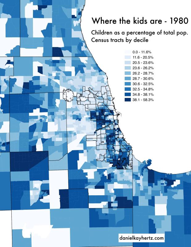
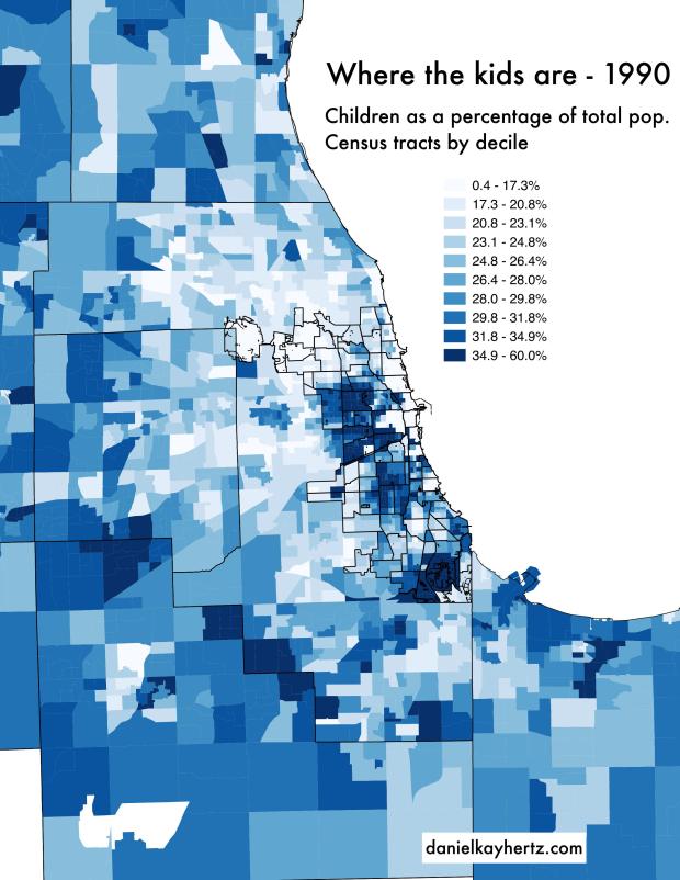
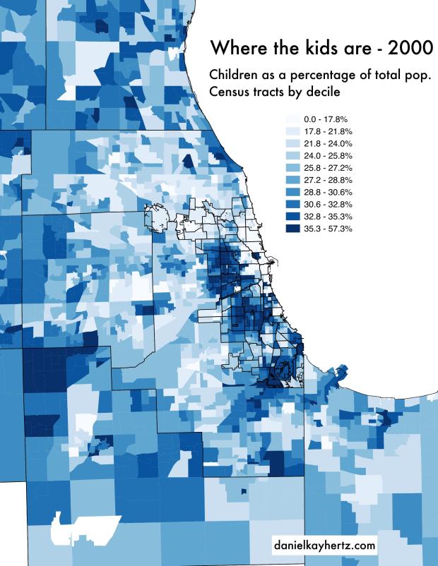
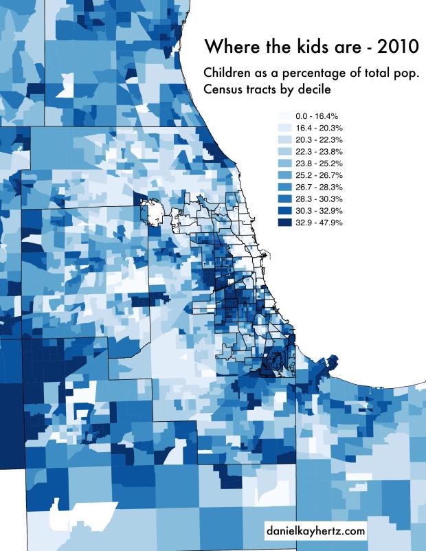
1. The kids are in the city

Where do children live in the Chicago area? The dominant narrative is that they are in the suburbs, certainly once they reach five or six: most parents just don’t feel comfortable sending their kids to the Chicago Public Schools, nor raising their kids in an apartment, and they can’t afford private school tuition and the cost of a single-family home in the city. (I’m not going to give any evidence that this narrative is the dominant one; if you disagree, I would love to hear what you think the narrative is!)

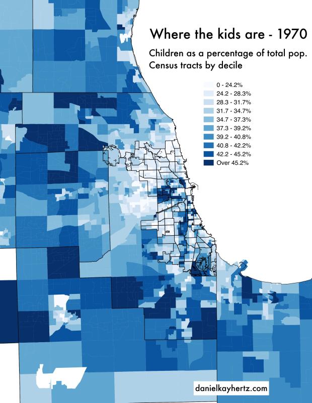
I was curious about whether this was true, so I went and made some maps. (Full size at the bottom of the post.)

This slideshow requires JavaScript.

To be clear about what these show: These are the percentage of people in each Census tract who are children (under 18), grouped by decile—in other words, the cutoffs for each shade of blue are such that there are an equal number of Census tracts in each of the ten categories. The darker blue the tract, the higher the percentage of kids. The darkest blue tracts are in the top 10% for having the most children; the lightest blue are in the bottom 10%. In short, these maps show a ranking of which neighborhoods have the most kids per capita.

The map shows not just the city (which you can make out in the center, with its 77 community areas outlined), but much of the metropolitan area. After the city’s web of community areas, the other borders are counties.

I would say there are at least three notable dynamics in these maps:

A. In basically each decade, there are two big concentrations of children: In a suburban ring; and on the city’s South and West Sides.

B. In each decade, the suburban ring of children gets farther and farther away from the city. At the same time, the concentration on the South and West Sides moves outward slightly, spilling into some of the inner suburbs.

C. The gentrified North and Northwest Sides become very low-kid as they gentrify.

(There are also some sort of second-tier things that stand out: The growing concentration of kids in the North Shore suburbs above Evanston; the relative desert of children in some of the more middle-class black neighborhoods of the South Side, like Chatham.)

So what’s the verdict? I would say the conventional wisdom is substantially wrong. In fact, at this point, a random Chicago neighborhood is likely to have a much greater population of children than many suburbs—certainly in Cook, and even DuPage counties. That is, there are way more kids in, say, Washington Park or Hermosa than in Skokie, or even Naperville. The sort of Levittown, tract-homes-with-young-families kind of postwar suburbia seems to mostly be a thing of the past, or at least a thing of the far-flung suburbs, rather than the inner ring, or even second ring.

The difference, of course, is that the kid-rich Chicago neighborhood is very unlikely to be white, and likely to be lower income. As with so many things—”everyone I know in this neighborhood drives,” for example—the conventional wisdom is driven by the behavior of the white and professional classes, who do, in fact, seem much more likely to have kids in the suburbs than in the neighborhoods they populate in the city.

2. The kids are coming back to the North Side?

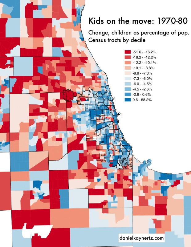
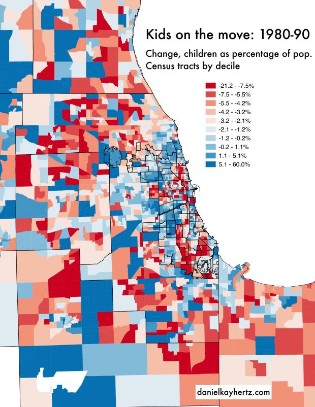
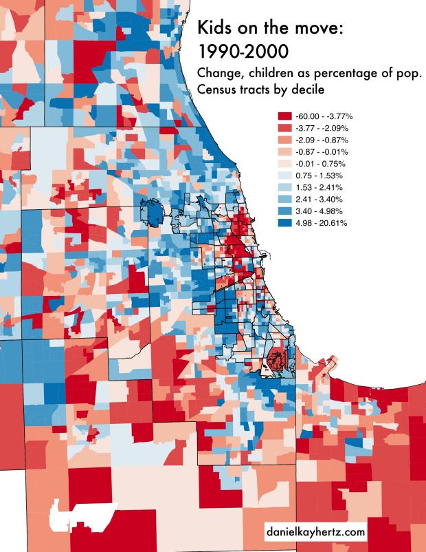
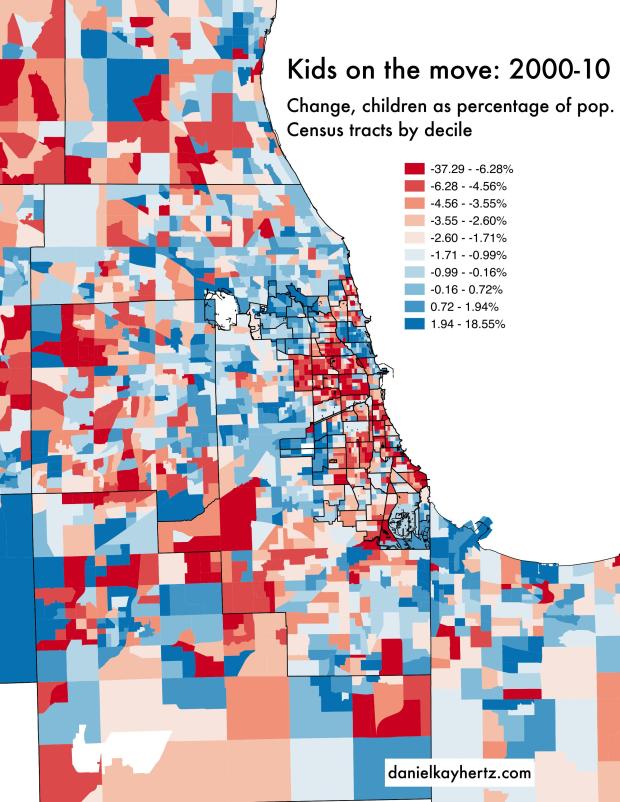
The number of kids is one thing; but to see trends, it’s helpful to map the changes in each decade. (Again, full size at the bottom of the post.)

This slideshow requires JavaScript.

Same as before, except now it’s the change in the percentage of children from one decade to the next. Tracts in blue are becoming relatively more full of kids; tracts in red are becoming less. Importantly, it’s not that blue tracts are seeing more kids in absolute terms: they might just be losing kids more slowly than the rest of the metropolitan area.

A few observations:

A. In some ways, the shifts here match what we saw in the first set of maps. From 1970 to 2000, the gentrifying North Side is falling in the children rankings quite rapidly.

B. In others, there’s a kind of inversion. In both the suburban ring and South and West Side neighborhoods with very high concentrations of children, the trend is mostly a falling in the rankings. That makes some sense, however, given what we know about both of those concentrations moving further out with time, suggesting a relative loss of children on their inner sides.

C. Here’s the big one: After generations of becoming virtually kid-free, the gentrifying North Side (really Lincoln Park, Lakeview, and North Center) ranked as one of the region’s fastest kid-growing populations from 2000 to 2010. If you look closely, you can see the beginnings of the trend from 1990 to 2000, as areas like Lincoln Park, very close to downtown, went from losing ground to roughly holding steady.

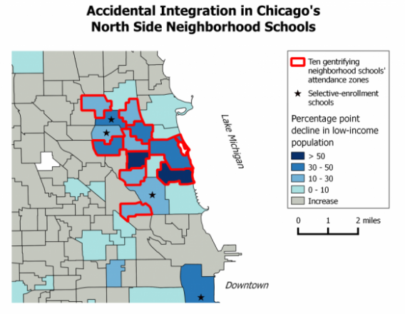
This matches some other reporting that gentrification has hit a kind of third wave in some of these neighborhoods east of the river, with artists having been replaced by upper-income childless professionals in their late 20s and 30s, who are now being replaced by mid-career professionals with children (and even more money). It also matches the growing trend of what you might call gentrification of neighborhood public schools.

screen-shot-2017-02-16-at-11-58-01-pm
From my 2014 Next City story linked above.

3. The full-size maps

kids70kids80kids90kids00kids10

kidch80kidch90kidch00kidch10