A bit ago, I wrote about how conversations about neighborhood change often paper over very real conflicts of interest among members of “The Community”:
A very common refrain in gentrification debates is that “the community should decide,” or that changes should “benefit the community.” But as Michael Kendricks points out, “the community” is always made up of many different people, with many different interests. Virtually any decision that’s made about a new housing development, or store, or transit project, will benefit some members of the community at the expense of others. That is politics, and anyone who has been to a neighborhood meeting about anything, large or small, has seen firsthand that neighborhoods are not above, or below, politics.
It’s far from an original observation to note that homeowners tend to benefit from gentrification, since rising property values directly increase their wealth. (Of course, they may also be squeezed if their property taxes increase much faster than their income.)
But we rarely acknowledge just how huge those stakes are. A new series from the Washington Post on the black professional class suburbs in Prince George’s County, Maryland (and Pete Saunders’ astute take on it) helps to quantify what happens to black wealth when home values don’t increase. The massive wealth gap between whites and blacks – several times larger than the income gap – is driven in large part by the difference in home values in mostly white neighborhoods compared to ones that are mostly black. And, as the Post explains, the extremity of that gap is in large part a result of the collapse of home values during the Great Recession:
The recession and tepid recovery have erased two decades of African American wealth gains. Nationally, the net worth of the typical African American family declined by one-third between 2010 and 2013….
Overall, the survey found, the typical African American family was left with about eight cents for every dollar of wealth held by whites….
Many researchers say the biggest portion of the wealth gap results from the strikingly different experiences blacks and whites typically have with homeownership. Most whites live in largely white neighborhoods, where homes often prove to be a better investment because people of all races want to live there. Predominantly black communities tend to attract a narrower group of mainly black buyers, dampening demand and prices, they say.
And the only obvious way to rebuild this wealth in the short to medium term is to raise property values in black neighborhoods. Which, whether or not that’s accompanied by racial change, is likely to price some renters and prospective buyers out.
This is not a “gentrification is clearly good, so stop complaining” argument. According to the Post story, only 43% of black Americans own their own home, so even strong gains in to property values would only go so far. But the issue of wealth deserves a more central place in the story of changing real estate values, and anyone whose knee-jerk reaction is to condemn rising home prices in non-white neighborhoods ought to have something to say about how else we can close the wealth gap.
Redeye‘s Tracy Swartz – one of the city’s best writers on the transportation beat outside of Streetsblog Chicago, to whom you should still give money – has an interesting article about why people choose to remain on transit (or not) while gas prices plummet. There are actually some interesting lessons in that part of the article, but I want to focus on this line:
Some CTA riders also don’t have cars to make the switch to driving when gas prices are low. About 16 percent of workers 16 years old and up don’t have access to a car to commute to work, according to U.S. Census Bureau American Community Survey estimates from 2008 and 2012.
Tracy showed me the ACS tables where she got that 16% number. But for the purposes of this article, I think they’re a bit (unintentionally) misleading. They tell us that 84% of Chicago workers live in a household with at least one car – but that’s not the same as being able to use a car to commute.
In my household, for example, there are three adults and one car. According to the Census, that means that all three of us have “access” to a car. But practically, only one can actually drive to work. Some households in a similar situation may be able to carpool, but given job sprawl and service sector work schedules, it’s unlikely that number is super large. (The Census says less than 10% of all workers carpool to work.)
So what’s a better estimate of how many workers can actually use a car to commute? To figure that out, I used this Census table, which gives the number of cars in a household by the number of workers.
First, in households with only one worker, about a quarter (113,000 out of 456,000) have zero cars.
Source: 2013 American Community Survey
Of the 254,000 households with two workers, about 11% (29,000) have no cars, and 38% (97,000) have one car. That translates to 155,000 workers without their own car.¹
Source: 2013 American Community Survey
Of the 57,000 households with three or more workers, about 9% (5,000) have no cars, 19% (11,000) have one car, and 31% (18,000) have two cars. That translates to at least 55,000 workers without their own car.²
Source: 2013 American Community Survey
So, altogether, there are at least 113,000 + 155,000 + 55,000 = 323,000 workers who can’t use their own car to drive to work.
The Census also tells us that there are about 1,191,000 workers in all. Which means that 323,000 / 1,191,000 = 27% of Chicago workers do not have their own car to drive to work. That’s a good deal more than 16%.
Incidentally, this also means that a huge number of Chicago’s workers – roughly 39% – live in a household where, even if they themselves drive, their spouse, or child, or parent, or friend, rely on public transit (or in some cases bikes) to get around the city. And that doesn’t include households where a high school or college student relies on transit to get to class.
Source: 2013 American Community Survey
¹ There are two carless workers for each zero-car household, and 29,000 * 2 = 58,000. There is one carless worker for each one-car household, so 97,000. And 58,000 + 97,000 = 155,000.
² There are three carless workers for each zero-car household, and 5,000 * 3 = 15,000. There are two carless workers for each one-car household, and 11,000 * 2 = 22,000. If each two-car household has three workers, then there’s one carless worker for each of those. (If there are more than three workers, then there’s more than one carless worker – but let’s be conservative.) So that’s 18,000. And 15,000 + 22,000 + 18,000 = 55,000.
First of all, Streetsblog Chicago – which, on a shoestring budget, regularly produces some of Chicago’s best reporting on urban transportation – is holding a fundraiser to buy new shoestrings and resume publication after a brief budget-related hiatus. It’s next Thursday the 29th, in the form of a pedway bar crawl with Moxie, the LGBTQ urban planning organization. It meets at 5:30 at Infields, in the basement of Macy’s on State Street.
Without Streetsblog, many of these stories simply won’t be covered anywhere. If you’re at all free, I’d love to see you there. If you can’t make it, consider pitching in electronically! Streetsblog Chicago is a fucking valuable thing, and we shouldn’t just give it away for fuckin’ nothin’.
Also, less importantly, I’m going to be speaking on a panel with the lovely Yonah Freemark and Pete Saunders about neighborhood change at UIC’s Urban Innovation Symposium. We’ll be speaking on Friday the 30th from 12:00 to 12:45 in the Lecture Room at Gallery 400, 400 S. Peoria. Come if you want!
A while ago, in one of his dumber moments, the urban economist Ed Glaeser wrote a report for the Manhattan Institute called “The End of the Segregated Century.” The headline came from the finding that all-white neighborhoods – meaning, literally, neighborhoods in which there existed not a single non-white person – were basically extinct for the first time in American history. Glaeser admitted that, of course, there were a good deal of the opposite type of neighborhoods – ones in which there were literally, or virtually, no white people – but minimized them by pointing out that most had declining populations. The emphasized takeaway was “the end of segregation.”*
Many people at the time pointed out that this conclusion was exceedingly silly. More recently, though, Dan Keating at Wonkblog took Glaeser’s data and drew a much more insightful, and important, conclusion: Segregation still exists, but “The End of the Segregated Century” does show that it’s changed in a really dramatic way over the last 40 years. Where once residential segregation was more or less symmetrical – over here we have overwhelmingly white neighborhoods, and over here overwhelmingly black ones – contemporary segregation is asymmetrical. White neighborhoods are increasingly mixed with Latino and Asian families (and a handful of African-American ones), while black neighborhoods are still basically all-black.
Keating illustrates that change by highlighting neighborhoods that are more than 85% white or 85% black in various cities around the country:
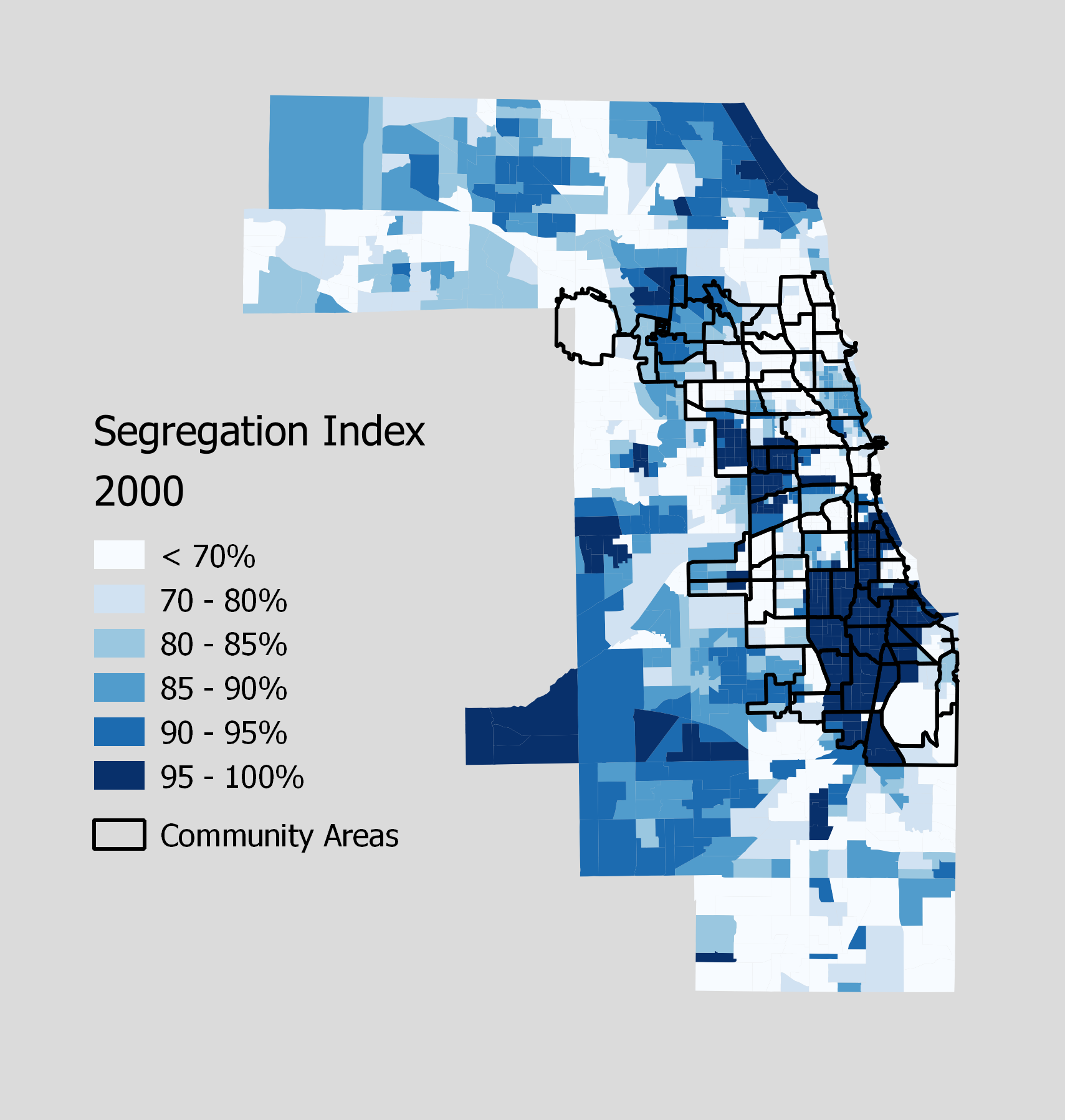
I had actually made a very similar series of maps before this was published, although I think Keating’s are easier to read. In mine, every neighborhood is colored according to a “segregation index,” which is just the percentage of residents who belong to the area’s largest racial/ethnic group. As a result, you can’t directly see which areas are mostly white and which are mostly black, but you can see a bit more detail in changes over time.
Every decade since 1980 has seen the gradual integration of neighborhoods all over Cook County, turning the heart of the Chicago metro area from a place where the typical neighborhood was 90-95%, or more, of a single ethnicity, to one in which those kind of communities are relatively rare.
Except for black neighborhoods.
Which have remained almost uniformly 95%+ black.
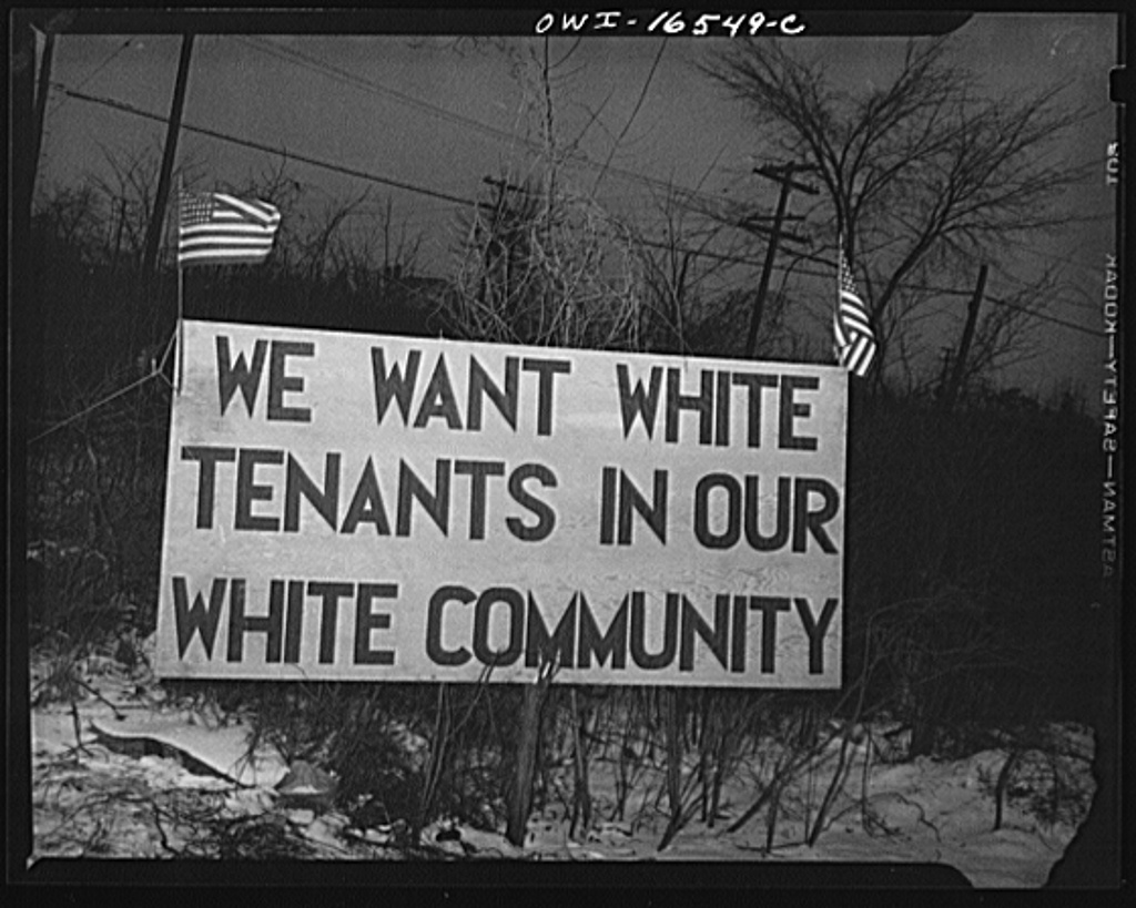
Ironically, this shift is partly explained by another Glaeser paper. In “The Rise and Decline of the American Ghetto,” he and another economist named Jacob Vigdor use data on housing prices, levels of segregation, and legal context to suggest that the forces that built and sustained black-white segregation from the early 20th century until about 1970 are different than the forces that sustain it today.
The theory goes that up until 1970, segregation was enforced through what Glaeser and Vigdor call “collective action racism”: that is, white people got together and decided to, say, legally prohibit the sale of homes in white neighborhoods to blacks, or use the housing finance system to keep blacks in certain communities, or build public housing in such a way that it maintained segregation. Outside of the legal system, whites organized formally and informally to intimidate blacks who moved into their neighborhoods. Sometimes, that looked like racist signs and vandalism. Sometimes, it looked like bombings, beatings, and riots.
This is the polite version.
But the Civil Rights era eviscerated a lot of the legal and financial systems that kept blacks and other non-whites out of white neighborhoods. (Even if it didn’t create new systems to reverse those wrongs.) Outright discrimination on the part of realtors or home sellers became much more risky. (Although it’s still quite common.) Slowly, it became unacceptable – from the point of view of both white peers and the police – to respond to a black person in your neighborhood by throwing a bomb through their window. (Though high-profile segregatory violence continued through the 1970s and beyond, especially around the issue of school integration.)
What didn’t change, however, was whites’ overwhelming preference not to live around black people. So segregation has declined only very slowly, thanks to what Glaeser and Vigdor call “decentralized racism.” By “decentralized racism,” they mean essentially shunning: whites won’t move to black neighborhoods, and they will flee their own neighborhoods if too many black people move into them. One result is that while in the pre-Civil Rights era, blacks paid more for housing than whites – because they were forced into relatively small, overcrowded neighborhoods with an inadequate supply of homes – today, whites pay more than blacks, in part because whites bid up prices in the limited number of communities with a sufficiently small number of black people. (Raising the possibility of racial arbitrage – a possibility which, as we discussed, has so far gone unfulfilled, because non-blacks apparently really don’t want to live around black people.)
Another way to visualize this is to show the change in the “segregation index” from 2000 to 2010.
Despite noticeable shifts all over Cook County – from the desegregating suburbs in the southwest, west, northwest, and north, to the increasingly-segregated (white) North Side, (Latino) far Southwest Side, and (white-becoming-black) south suburbs, the established black ghettos on the city’s West and South Sides are almost totally unchanged.
Why does this matter? There are a number of things, but one in particular, I think, is that it suggests one of the problems with segregation: the issue is not just that white and black people live in different neighborhoods, but that black neighborhoods are shunned in a way that other ethnic enclaves – from Pilsen to Chinatown to the Indian-Pakistani Devon Avenue – are not, and in a way with really powerful negative consequences for successful businesses, schools, wealth building through homeownership, and so on. This is one reason that I’m so allergic to the rhetoric around violence in Chicago: treating the entire black South and West Sides as if they were “war zones” – places where you take your life in your hands just visiting – is one of the main ways that the shunning of black neighborhoods is openly justified among whites and other non-blacks. It’s why a bunch of ten-year-olds wrote an open letter to the rest of the city begging you not to be afraid of them.
There are, however, a handful of places where black neighborhoods are integrating in Chicago. I’ll go over them in more detail in a future post.
* It’s a pattern that recurs with some frequency: Glaeser does excellent empirical work, and then draws odd conclusions from the very useful numbers he finds.
James Rudyk says affordability doesn’t mean housing values have to remain stagnant or that certain people or businesses should stay out.
But…by definition, it kind of does, doesn’t it? If housing values don’t “remain stagnant,” then they’re growing. Another way of saying that housing values are growing is that housing is getting more expensive. In a neighborhood (Belmont Cragin, in this case) with home prices already above the city average – in a city where something like half of all residents are paying more than 30% of their income for a place to live – that suggests that every increase in housing prices is going to stretch the budget of some people who live in the area, and put the community beyond the reach of other city residents who might like to move there for better schools, safer streets, etc.
In other words, affordability will suffer.
This is the fundamental problem with using housing as our country’s main vehicle for wealth accumulation: as soon as you buy a home, you have an enormous incentive to see its value grow. But that interest, of course, is directly opposed to the interests of any people who might want to buy, who want – in many cases, need – housing prices to stay flat or even decrease in order to find a place to live. In a place where the vast majority of homes are not subsidized for the low- or moderate-income – and Chicago will be that kind of place for the foreseeable future – that means that strong returns to housing are directly opposed to affordability.
It also means that statements like this are really hard to take from theory to reality:
“If residents on Diversey and Laramie really do want a Starbucks, then let’s put in a Starbucks. If they really do want a Trader Joes, then let’s put in a Trader Joes. If they’re really fine with the fruit market, let’s leave the fruit market. So the question is, who makes that decision?,” he said.
Rudyk hopes it’s the people who live here, and not outside investors. He says that may determine whether Belmont Cragin redevelops or gentrifies.
This imagines that there are two groups of people: Belmont Cragin residents, and “outside investors.” But that’s not really true.
@DanielKayHertz because the ppl in the community (homeowners, renters, biz owners) have very different incentives
A very common refrain in gentrification debates is that “the community should decide,” or that changes should “benefit the community.” But as Michael Kendricks points out, “the community” is always made up of many different people, with many different interests. Virtually any decision that’s made about a new housing development, or store, or transit project, will benefit some members of the community at the expense of others. That is politics, and anyone who has been to a neighborhood meeting about anything, large or small, has seen firsthand that neighborhoods are not above, or below, politics.
It’s tempting, in this as in any situation, to try to find a way that everyone – or everyone you consider a “good guy” – can win. Unfortunately, I think there’s a lot more conflict here among the “good guys”* – conflict that isn’t about misunderstandings, but about real and immediate self-interest – than we’re willing to admit.
* I say “good guys” because I don’t think there’s anything nefarious about a middle class family in Belmont Cragin wanting home prices to increase in their neighborhood so they can have some financial security for retirement. The point, though, is that the consequences of that totally benign goal – multiplied by hundreds of thousands of homeowners – are anything but benign for people caught on the wrong side of affordability.
This blog, and all the people I’ve met through it, have been an unexpected highlight of my year. Thanks, everyone. I’ve included a few of my favorite posts and articles below, in case you want to get on top of your 2014 blog reading nostalgia early.
Warning: this post gets a bit into the legislative weeds.
So as I wrote at Next City, Mayor Emanuel’s affordable housing commission just announced their recommended amendments to the city’s inclusionary zoning law, or ARO. (Affordable Requirements Ordinance.) Mostly, this involves closing or tightening loopholes that allowed developers to push new subsidized units out of wealthy neighborhoods, and into poor ones.
But one other provision gives me pause:
On page 9 of the ARO proposal. Click for a link to the document.
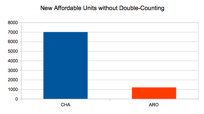
To summarize: the Chicago Housing Authority (or other “authorized agencies”) can buy ARO-produced units and run them as their own. In fact, not only can they do that, but the city is giving developers a financial incentive to sell. If someone builds a 40-unit building on the North Side, the new ARO says they’re responsible for four subsidized units, or an equivalent fee; one of those units has to be on site. If the developer chooses to pay the fee for the remaining three, that’s $375,000 (at $125k per unit). But if the developer sells the one unit they built to the CHA, they save $25,000 in fees per remaining unit – meaning $75,000 in all.
Anyway, at first blush, I don’t see any reason why converting ARO units to CHA units is a problem. Except for this: Rahm Emanuel has announced that he wants the ARO to create 1,200 units of affordable housing over five years. The CHA, separately, has a longstanding commitment to maintain 25,000 units of housing, of which it is short about 7,000. In other words, it appears that we currently have a commitment from the City of Chicago and its partner agencies for 1,200 + 7,000 = 8,200 new units of affordable housing over the near term.
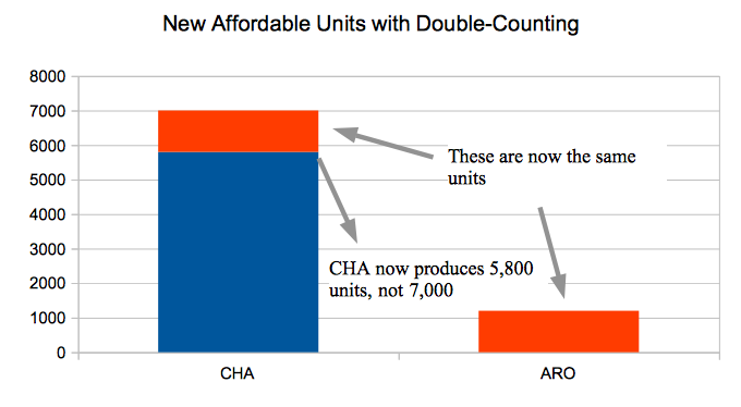
The issue is what happens with units that are produced by the ARO, and then bought by the CHA. Presumably, Emanuel – or whoever is mayor at the time – will want to tout those as “ARO units,” since they would have existed without the law. Presumably, the CHA will also count them as “CHA units,” because, you know, they’ll be CHA units.
But what that means is that we’ll be double-counting. And in the extreme (though possible!) scenario that the CHA buys all 1,200 ARO units, instead of 8,200 new subsidized housing units, the city will get only 7,000 – because every unit the CHA buys from the ARO is a unit they don’t have to produce separately themselves.
Here is this idea in chart form:
Anyway: the stated purpose of the ARO amendment is to improve upon the old ARO, which only produced 189 affordable units over 7 years, or something like that. But double-counting, by creating the possibility that every new ARO unit will simply displace a CHA unit that would have been created, also makes it possible for the new ARO to have zeronet impact on the total number of affordable units in the city. That is, if you look at the graph above, double-counting every ARO unit would leave the city with 7,000 new units – the same number the CHA would be obligated to provide if the ARO didn’t exist at all.
Now, caveats: I’ve asked around about this, and haven’t yet heard any reason that would prevent the CHA from buying up all the ARO units, but it’s possible that such a reason exists, and I’m just not yet aware of it. If you know of that reason, tell me!
It’s also possible that, even though the CHA has promised 7,000 new units, the CHA’s pants are on fire, and there’s no way they’re actually going to deliver that any time soon. In which case the ARO isn’t displacing CHA units, because the CHA can’t/won’t produce new units on its own. Maybe. That seems like a pretty unsatisfying answer, though: if you’re the City Council (or, say, the mayor), why not just find a way to force the CHA to live up to its promises?
Am I getting this wrong somehow? Or does there need to be some safeguard in the new ARO?
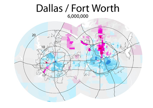
Since my last post, I was reminded of the existence of this, from Radical Cartography. One point Bill Rankin makes there, which is really important, is that the “donut model” of economic geography, with concentric circles of high- and low-income areas, is really not the American standard. More common is the “wedge model,” with a “favored quarter” radiating out from the city center like an especially privileged slice of pizza.
For example (in Rankin’s maps, pink = rich and blue = poor):
If you take another look at my maps for Chicago…
…you might reasonably ask: how sure are you that the growth of a high-income zone in the central city is following the donut model, versus the wedge model? After all, it seems to be growing mostly towards the already super-wealthy northern suburbs. Maybe the endgame is a wedge, after all.
To which I would reply: yes, I think there’s something to that. But what matters, I think, is what’s at the center. Going back to the rent gap theory, a building’s potential rents will only be high if it’s close to jobs or amenities that make the area valuable. In all of the extreme wedge examples above, the downtowns don’t really serve quite the same central economic or cultural role for their respective metropolitan areas as does downtown Chicago, and so areas adjacent to them – say, the southern end of downtown Atlanta, or the areas to the north of downtown St. Louis – aren’t especially close to a major job or amenity center. Instead, those centers are further out in the suburbs, and high rents revolve around them, following major transportation corridors.
In other words, northern Bronzeville’s position, I’m guessing, really isn’t anything like whatever neighborhoods are a mile or three east of downtown Houston: it’s actually in close proximity to the region’s largest amenity hub, and they aren’t.
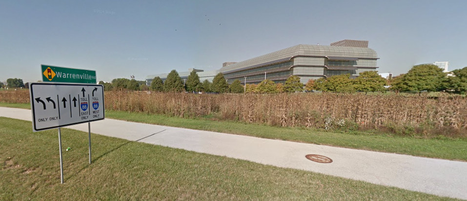
Now, what gives the wedge model a bit of weight in Chicagoland is that the Loop isn’t the only major employment center. In fact, even if you know nothing about the Chicago area, you could easily pick out the other employment centers just by looking at the map: they’re in the northern suburbs and along a corridor running along I-88 in second- and third-ring suburbs southwest of the Loop. They are, not coincidentally, close to the two largest other major high-income areas. (Though the high-income areas near I-88 continue to move away from where the actual jobs are, which is something that should maybe trouble people with a vested interest in keeping those jobs there.)
Who could say no to working here? Naperville, Illinois. Forgive my urban snobbery.
Anyway, the point is that things are complicated, and basically every major metropolitan region in the world is polycentric, which does weird things to potential rents, and thus the prospects of disinvestment and reinvestment. You don’t even have to go outside the city to see that: though it’s much less dramatic, Hyde Park – the little patch of white along the south lakefront – has seen a very small ripple of reinvestment expand from its major employment center, the University of Chicago. The problem there, of course, is that Hyde Park is surrounded entirely by black neighborhoods (and South Kenwood, a mixed neighborhood, beyond which is North Kenwood, and almost entirely black neighborhood), which, as we discussed last time, makes the reinvestment stage difficult.
Oh, the backlog of things I want to write! To work:
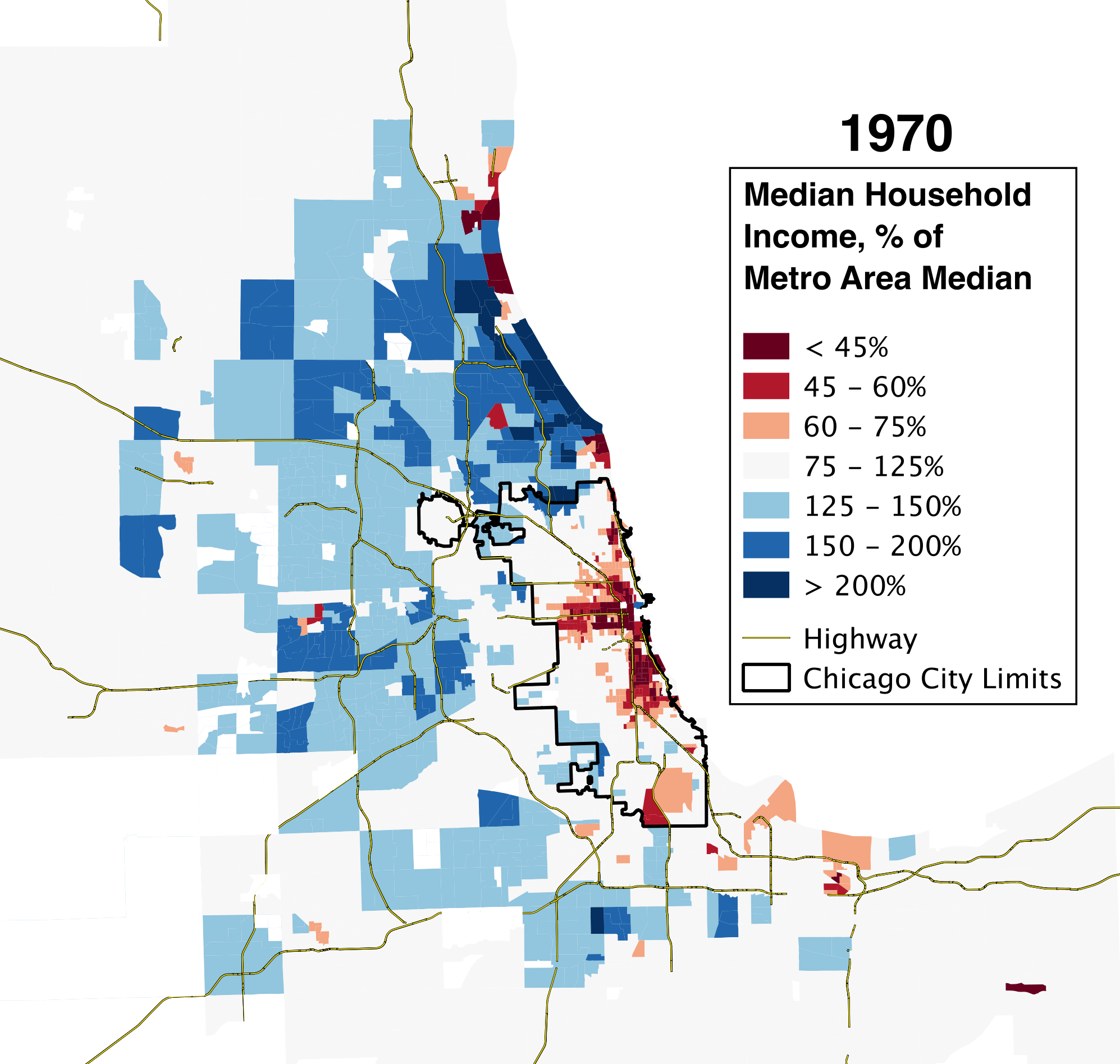
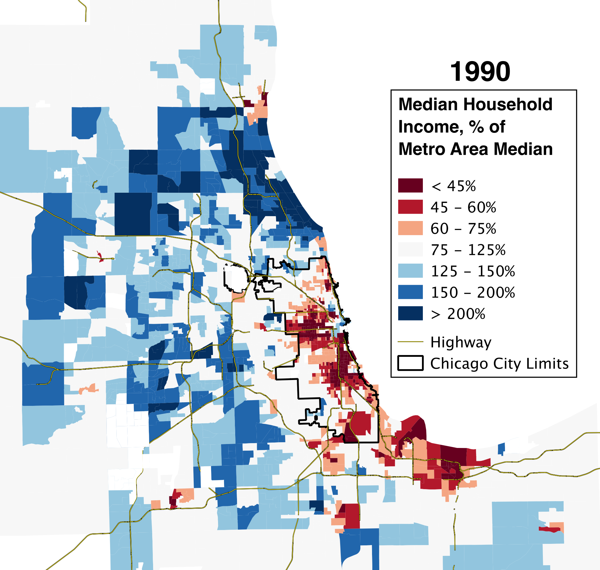
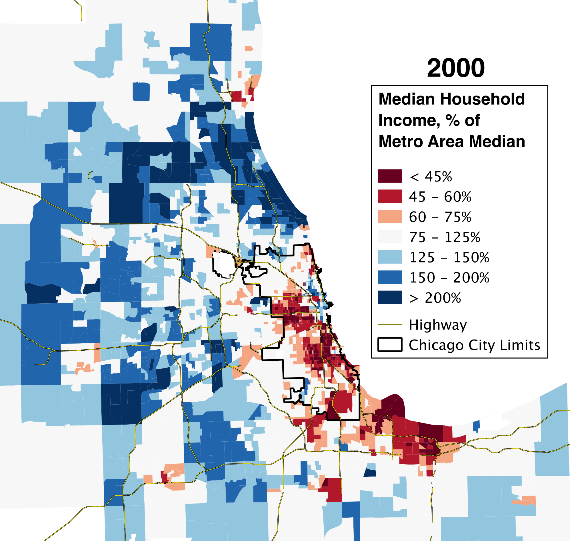
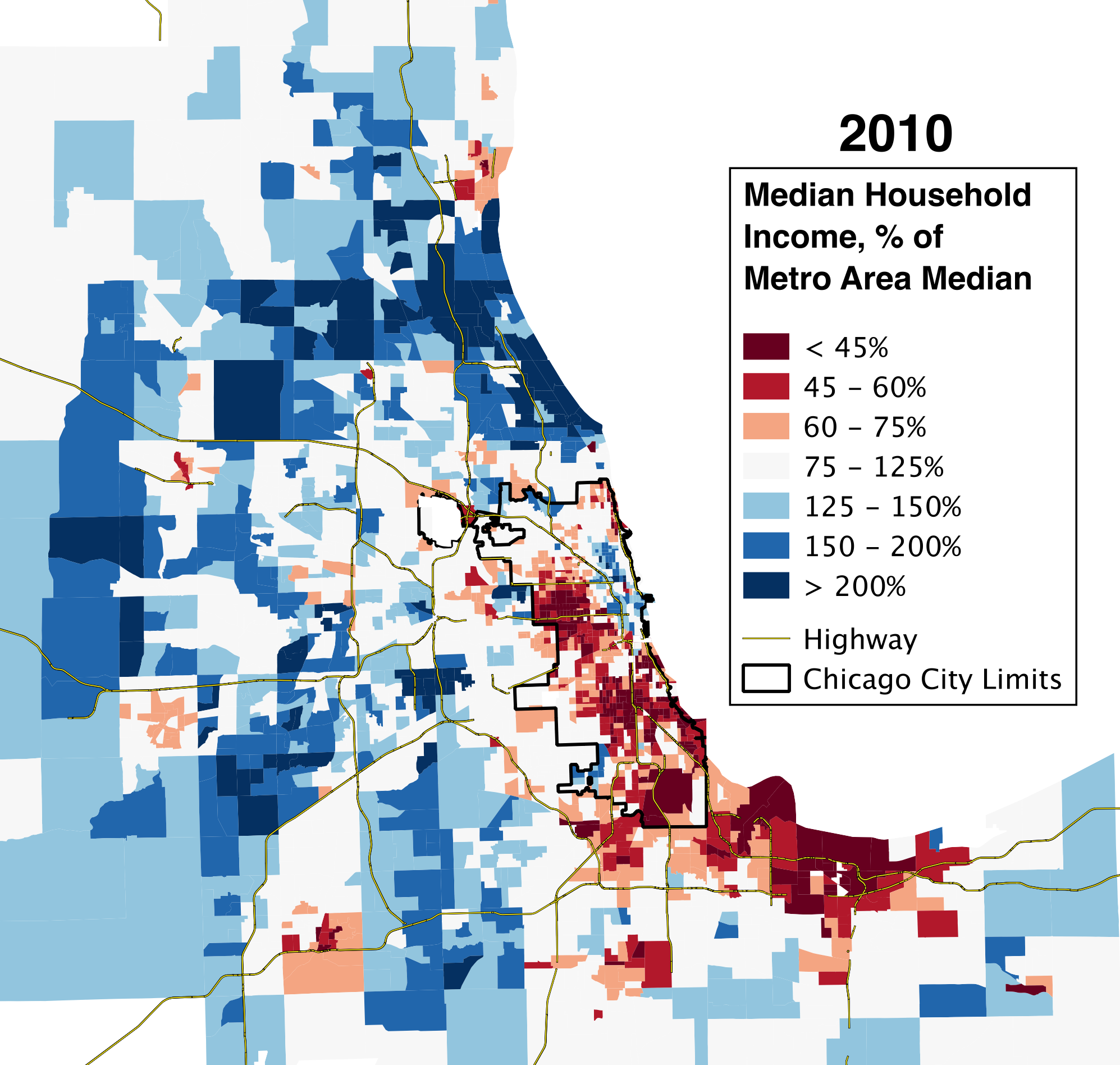
Other than “oy,” one of the most common reactions I got to the “vanishing middle class” maps I made several months ago was that focusing on the city proper necessarily missed the very important shifts occurring in the suburbs, where something like two-thirds of the people in the Chicago region live. In fact, it missed what was maybe one of the more important stories about the changing economic geography of the region over the last 40 years, which is a shift in the balance of economic power between the city and suburbs.
That’s true, so I’ve finally made equivalent maps for the entire Chicago metro area. (The researchers who provided my original data, Sean Riordan and Kendra Bischoff, made their own maps a little bit ago, and Whet Moser made some valuable graphs from their data. I’m going to use my own maps, though, from Brown’s Longitudinal Tract Database, so I can show the data in a way that’s most consistent with how I did the previous post.)
Here they are:
I think, on the one hand, that these regional maps show something very much like what Aaron Renn has described as a “new donut” pattern of urban wealth: a rich center, a ring of disinvestment, and then another outer ring of wealth in the outer suburbs. Importantly, though, I think these show that there’s nothing really “new” about this pattern – instead, the rings have existed since at least 1970, and have simply been moving further and further out from the center of the city.
Even in the first map, there’s a kernel of wealth around the Gold Coast, surrounded by extreme disinvestment, surrounded by middle-class neighborhoods, surrounded by relatively wealthy ones. In each succeeding decade, the general pattern is for the kernel of wealth to gentrify a bit of the surrounding disinvested neighborhoods; for middle-class areas adjacent to disinvestment to decline into disinvestment; for relatively wealthy areas adjacent to the middle-class ring to slip down a bit; and for some parts of the periphery to become more wealthy.
It’s a pattern that, if you’ve read Neil Smith on the rent gap theory of gentrification, makes a lot of sense. The idea is that waves of investment, disinvestment, and reinvestment in urban neighborhoods are driven by the semi-permanent nature of buildings themselves. In the beginning, say, someone builds a three-flat in a neighborhood near downtown. When it’s brand-new, it’s a highly desirable place to live, but over time, things deteriorate a bit, and newer construction further out steals away the high-income residents who can afford housing with better technology and more up-to-date styles. Importantly, the aging three-flat is not torn down or significantly renovated, because the difference between what the owner can actually charge, and what they could charge if it were a brand-new building, is smaller than the cost of demolishing the property and actually constructing a new property (or a gut rehab).
(That is: If you earn $10,000 from a building you own, and could make $15,000 if you rebuilt/rehabbed it, but rebuilding/rehabbing costs $10,000, you won’t do it. Because, you know, you’d lose money.)
As it ages, the building itself becomes less and less desirable, and so the people living there become poorer and poorer; if the surrounding buildings were all built around the same time, then something similar is probably happening in the neighborhood at large. But at some point, the calculation changes: the building becomes so low-rent that the extra income an owner could get if it were brand new is more than the cost of replacing it. (It might also be the case, of course, that the building’s rent hasn’t fallen that much more, but the value of a new/rehabbed building has increased a lot – if, say, the three-flat is in a neighborhood near other neighborhoods that have seen an increase in amenities and jobs.) At that point, since it’s profitable to do so, the owner will do a major rehab or reconstruction, and gentrification begins.
(That is: If, from the previous example, the $10,000 you’re earning dwindles to $4,000, all of a sudden rebuilding/rehabbing becomes profitable. Alternatively, if you’re still making $10,000, but a rebuilt/rehabbed building would give you $25,000 – again, rebuilding/rehabbing becomes profitable.)
For example: these townhomes in Logan Square. Credit: YoChicago
As I said, to a large extent, I think this describes what’s going on here. But anyone familiar with Chicago’s racial geography will have already noted that there’s something else, too. (If you’re not: basically all of the deep-red areas are segregated black neighborhoods. A few are predominantly Latino.) Namely, black neighborhoods seem both to suffer much faster disinvestment than you see elsewhere, and to be less able to reach the reinvestment part of the cycle. Neither of those things are news – there have been several reports about how “black neighborhoods don’t gentrify” already this year – but I think it’s particularly striking in this context. It’s not just that black neighborhoods don’t gentrify: it’s that anti-black racism is so strong that it overcomes, and arrests, the regional pattern of disinvestment and reinvestment.
Or consider the problem from a different perspective. Some people have described gentrification as a process of “racial arbitrage.” Arbitrage, more commonly, refers to someone profiting by taking advantage of the fact that the same good has different prices in different places. (For example, you might buy cheap cigarettes in Indiana and sell them at a markup in Illinois, where taxes make cigarettes much more expensive.) In this view, some disinvested neighborhoods aren’t just cheap because their housing has deteriorated; they’re cheap because most of the people who live there are non-white, which makes white people not want to live there. Since white people make up a large number of buyers in the housing market, that means demand crashes, and so do prices.
But that also means that if you’re one of the few white people who doesn’t care about living around people of color, you can save a bunch of money by moving to a non-white neighborhood of roughly equal “quality”(whatever that means for you). Each additional white person who does so, however, makes the neighborhood that much whiter – and as a result, that much more comfortable for the majority of white people. At some point, the neighborhood is white enough that most white people are willing to live there, which brings up both actual and “potential” housing prices, inviting a wave of reinvestment and more gentrification.
It appears, though, that anti-black racism is so strong that there are virtually no white (or other non-black) people willing to move into black neighborhoods, even if it means saving a lot of money. In other words, regardless of whether you think this is good or bad, racial arbitrage doesn’t work in black neighborhoods. Even in places – northern Bronzeville, say – where proximity to jobs and transportation would make you think that it would be an attractive option, there is vanishingly little evidence for it. As a result, potential rents depend entirely on the purchasing power of a disproportionately poor quarter of the population, and stay relatively low.
Chatham demonstrates racial arbitrage fairly well: these bungalows would cost a good deal more in a similarly far-flung non-black neighborhood. Credit: YoChicago
These two concepts – the rent gap theory and the racial arbitrage theory – are both, I think, really helpful in understanding how Chicagoland’s economic geography has changed over the last 40 years, and how it’s likely to change in the future. The foundation is a tendency for an expanding donut-shaped ring of rich and poor neighborhoods as a result of cycles of investment and disinvestment in housing. On top of that – no less powerfully – are the consequences of racism, which have a number of effects. First, they accelerate disinvestment as white people and their resources flee non-whites, and as new non-white residents are discriminated against in the provision of retail outlets, public safety, functional schools, and so on. Second, they open up the possibility of racial arbitrage: that is, another way for “potential rents” to rise and attract reinvestment and gentrification. Third, for black neighborhoods in particular, they can freeze an area in the disinvestment phase by acting as a sort of ceiling on potential rents.
Finally, of course, zoning laws can act as an accelerant on the reinvestment/gentrification phase by effectively capping population in neighborhoods where lots of people would like to live, forcing some of those people to move to adjacent communities, and raising actual and potential rents there.
There’s obviously quite a bit more to say about all this; hopefully I’ll find the time to do so soon, and hopefully I’ll also hear from other people who have thought of things I haven’t. But, as I’ve said before, neighborhood change is easy to experience – and is too often talked about – as a kind of capricious, unpredictable thing. In reality, it appears that it’s heavily influenced by certain patterns and rules. To the extent that we’re unhappy with what neighborhood change looks like, understanding those rules, so that we can change them, seems important.
So during an otherwise lazy weekend, I’ve finally launched a minor project I’ve been thinking about for months: the Chicago urbanist calendar. (There’s also a link to it up at the top of the page.) Basically, I am in a near-constant state of agitation as a result of missing events I’d like to go to because I only hear about them after they happen. To avoid that – and as a gracious public service – I’m now collecting all potentially interesting urbanist-related Chicago events in a public Google calendar, and hosted on this blog. The events range from governmental meetings that are open to the public, to civic hack nights, to architectural tours, to university panels on housing and gentrification; I’m trying to err on the side of including too much, rather than too little. To that end, if you or anyone you know is involved with any events coming up soon or in the more distant future – or know of an organization that regularly or occasionally puts on events that should be on this calendar – let me know! You can either email me (danielkayhertz [at] gmail), or leave a comment on the calendar page. (I won’t publish the comment, but I will add it to the calendar.)
Alternatively, if you have any ideas for how to make the calendar better or more useful, let me know! Hopefully this is something that will get refined over the next few months.


